
A gray dinky shop was in the corner, and you arrived on a lazy Sunday afternoon. There were assorted items, but you wanted this day to be special. You took out some coins and chose a couple of things: a hotdog and a coke. You slid the coin into the automat, a predecessor of the modern vending machine, and there came your food. Fascinated and famished, you set out to eat them in solitude, back in your car.
The above story would have been true in the early 20th century, just at the cusp of when fast food would conquer this great nation. Since then, we have seen multiple evolutions of it, from the drive-thrus that started in the 1920s to the modern fast-food chains we see today. It won’t be wrong to say that fast food, currently exported to the rest of the world, has been deeply ingrained in American culture.
Precisely, this statement started our quest to understand how people eat, perceive, and experience fast food in America. We wanted to understand people’s obsessions and pet peeves and hear directly from their mouths. So, the best source for them was what people write about them – in the reviews.
That’s where Scrapehero came in, and we combined three products for this:
- The Data Store, where we got a bundle of Top 10 Food Chains In the USA
- Google Maps Scraper for Local Business Information from ScrapeHero Cloud to gather the place-ids of each location
- ScrapeHero Cloud’s Google Reviews Scraper to gather the reviews for each location.

The store dataset gave us the list of locations of the fast food chains, including their latitude and longitude, which we were able to pass into Google Maps Scraper to get the Place ID, which we finally passed to the Reviews Scraper. The process was extensive and lengthy, but Scrapehero’s offerings made it easy and seamless, and we could scrape all this information without writing any code.
For our final analysis, we chose the following fast-food chains:
- McDonald’s
- Starbucks
- Chick-Fil-A
- Sonic Drive-In
- Dunkin Donuts
- Arbys
- Waffle House
- Buffalo Wild Wings
- Raising Cane’s
- Jimmy John’s
- Tim Hortons
- Baskin Robbins
This list gives us a large variety of chains to work with, which will help us understand the fast-food industry better and cover reviews from a wide range of individuals of varied tastes.
Enough talk; let’s dive into the analysis and see what insights we can draw from the data.
Tools Needed, Data Preparation & Some Basic Exploratory Data Analysis
We compile the above data into a CSV file, the open standard primarily used for datasets. However, there is one catch: the data is huge, around 12 GB. It is too big to fit in the memory of most traditional computers.
Thankfully, we have tools like Dask and Spark, which we can use to wrangle this data. These distributed computing frameworks can spread our analysis over several cores of your system and even several systems if you have them. These frameworks also can do out-of-core computation, meaning they don’t need to load the whole dataset in your RAM; thus, you can efficiently work with large datasets like ours.
However, the technicalities are not the focus of today’s topic of discussion; we wanted to let you know what tools you will need to derive insights from large datasets.
For our task, we will use Dask. Coming from a Pandas background, Dask has a similar API so that we can execute most of our Pandas code without many changes. We import Dask to our notebook with this:
from dask.distributed import Client, LocalCluster, get_worker
import dask.dataframe as dd
import dask
You can now load the CSV file, like you do in Pandas, with the read_csv() function.
df = dd.read_csv(data_path)
Now, the first thing we all do when we get a dataset is look at its number of records, and that’s where the handy len() function comes in.
len(df)
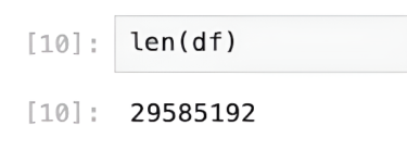
That’s around 30 million rows of data. However, we will not be able to work with all the reviews since most of the user-generated data on the internet is messy, and it will need some cleaning before we can apply our analyses. This process will remove the noise and give us much better results.
Let’s look at the table structure and what fields we have to work with.
df.head(10)
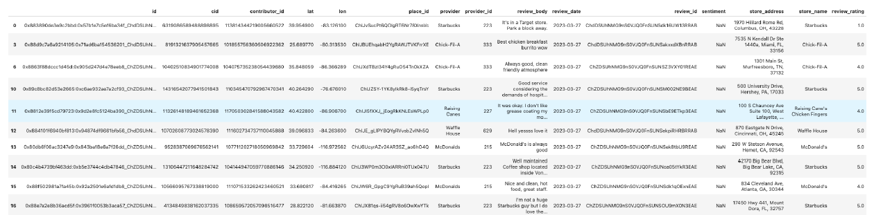
- id
- cid
- contributor_id
- lat
- lon
- Place_id
- state
- provider
- provider_id
- review_body
- review_date
- review_id
- sentiment
- store_address
- store_name
- review_rating
Since Dask is a distributed framework, especially for big data, it doesn’t work well with CSV files. CSV is not very big data-friendly, and a faster and more efficient way to work with data as large as this will be to convert them to Parquet file format.
Dask also has the concept of partitions, like Apache Spark, where you divide the data into multiple parts, work on each individually, and then combine the results. This way, you can assign a partition’s computation to each core and thus improve scalability.
You can repartition the data before storing them as Parquet.
df = df.repartition(npartitions=300)
And then, finally, convert it.
df.to_parquet('reviews_fast_food_before_clean/')
Now, load the parquet file with read_parquet, and you will automatically get all the benefits of parallel computation.
df = dd.read_parquet('reviews_fast_food_before_clean/')
The first cleaning task we will do is to drop the null rows, which do not have any data.
df = df[~df['lat'].isna()]

df = df[~df['lon'].isna()]

df = df[~df['store_address'].isna()]

df = df[~df['review_body'].isna()]

df = df[~df['review_date'].isna()]
We dropped all the rows with NA values in latitude, longitude, store address, review body, and review date. This is the crucial information we need, so it’s useless if the data is null there.
Since one can write reviews in languages other than English, we will filter them out for now. For the purpose of this article, we will only focus on reviews written in English.
We can use Fasttext’s language identification model for this. We have written the following utility function, which you can use.
def get_language(content):
    lang_model_path = 'lid.176.bin'
    worker = get_worker()
    try:
        lang_model = worker.lang_model
    except AttributeError:
        lang_model = fasttext.load_model(lang_model_path)
        worker.lang_model = lang_model

    predicted_lang = lang_model.predict(content)[0][0]
    return predicted_lang

def get_language_map(df):
    return df['review_body'].apply(get_language)

df['lang'] = df.map_partitions(get_language_map, meta=(None, str))
df = df[df['lang'] == '__label__en']
Next, we will filter out the unnecessary columns, which we will not use for our analysis.
df = df[['lat', 'lon', 'provider', 'review_body', 'review_date', 'store_address', 'review_rating', 'state']]
Our final data frame looks something like this:
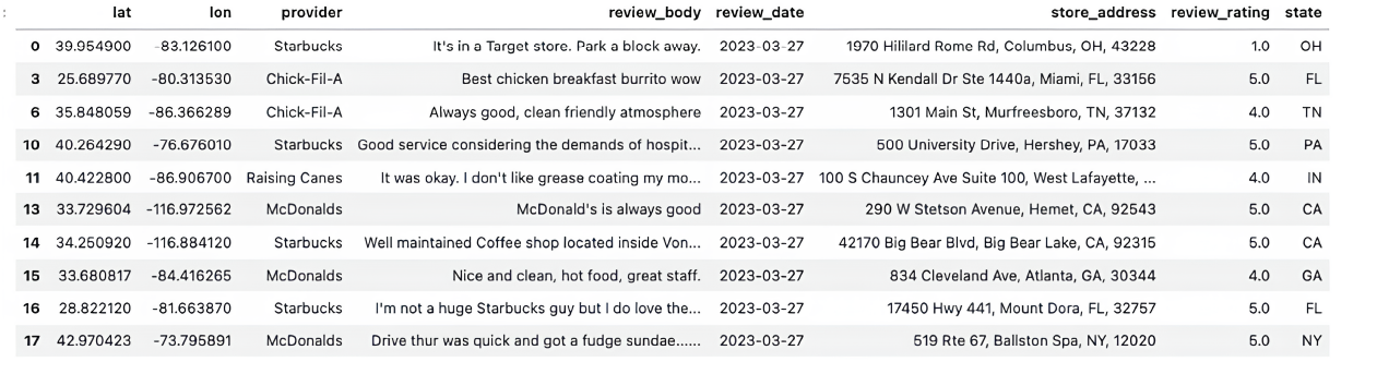
Perfect! You can now store this intermediate cleaned data to parquet using the above functions if you need to do this analysis again.
Let’s look at the number of reviews that each fast-food chain has. We can quickly group by the provider and choose the review text field to count the reviews. We can sort the results in descending order.
df.groupby('provider')['review_body'].count().compute().sort_values(ascending=False)
When we plot this data, we get something like this:
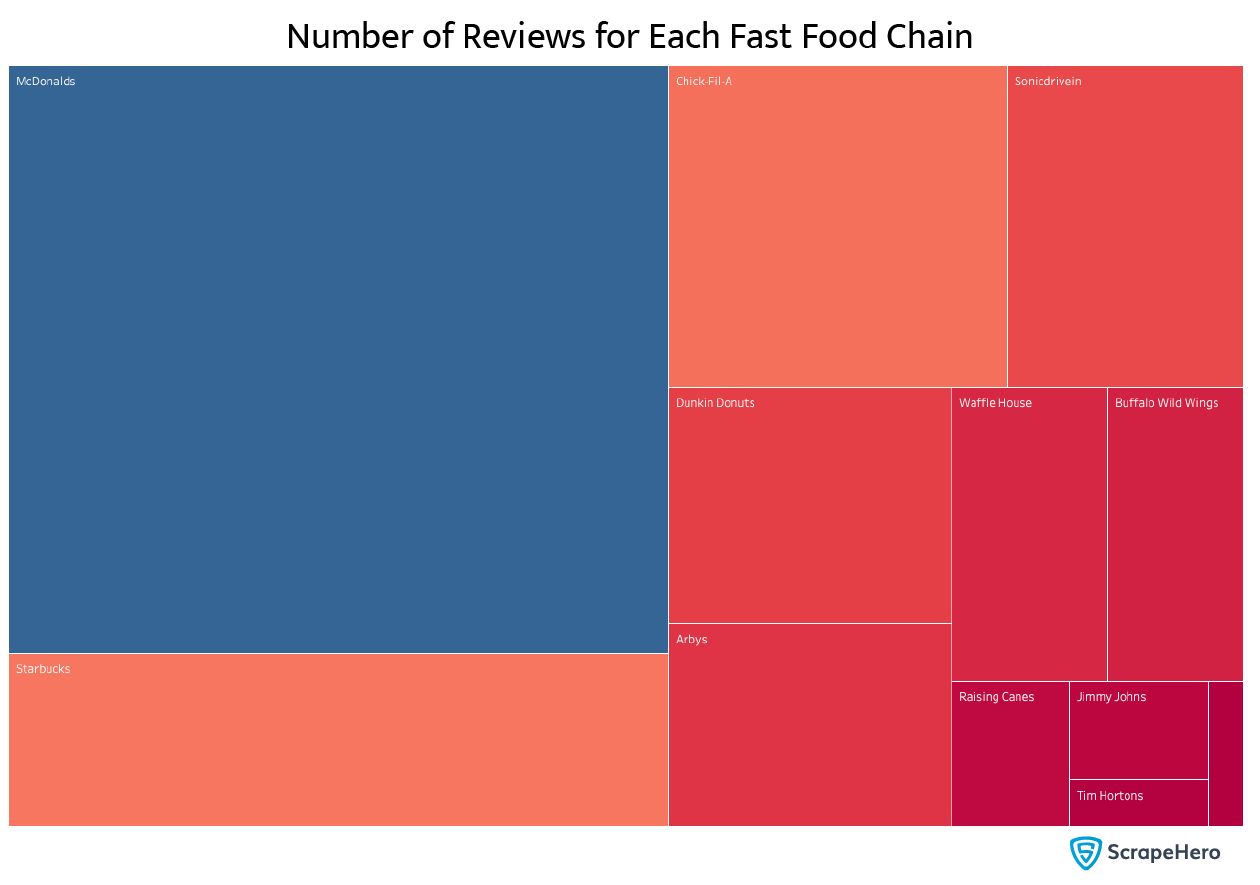
This shows that McDonald’s has the most significant number of reviews by far, an excellent sign of its popularity. It beats the next fast food chain, Starbucks, by a whopping 5 million reviews.
Where are these fast food restaurants? Are there any interesting concentrations of them? We can find that by plotting the providers on a map. Since each restaurant can have multiple reviews, we need to group by latitude, longitude, and provider to find their unique combinations. And finally, we plot the results on a map.
df.groupby(['lat', 'lon', 'provider'])['provider'].count().compute()
When we ran the above computation, we got 56,288 restaurants across all providers. When we plot the data on the map, we get something like this:
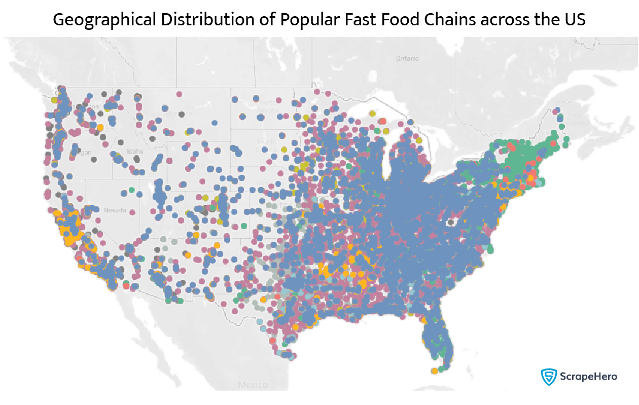
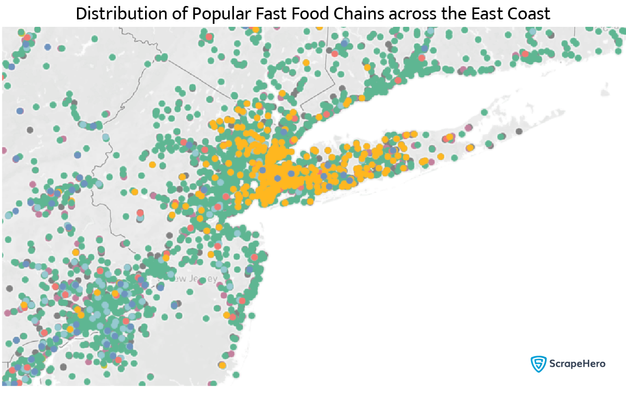
This map is a bit crowded, but there is a significant concentration towards the east coast, which correlates with a higher population density. The fast food chains are also color-graded. We can zoom in to see the city of New York.
A better way to visualize this will be to get a color-graded map based on the number of stores. We can do that by using the following code.
states = df['state'].value_counts().compute().index
df_temp = []
for state in states:
    df_state = df[df['state'] == state]
    df_unique_providers = df_state.groupby(['lat', 'lon', 'provider'])['provider'].count().compute()
    df_temp.append({'state': state, 'number_of_stores': len(df_unique_providers) })
df_temp = pd.DataFrame(df_temp)
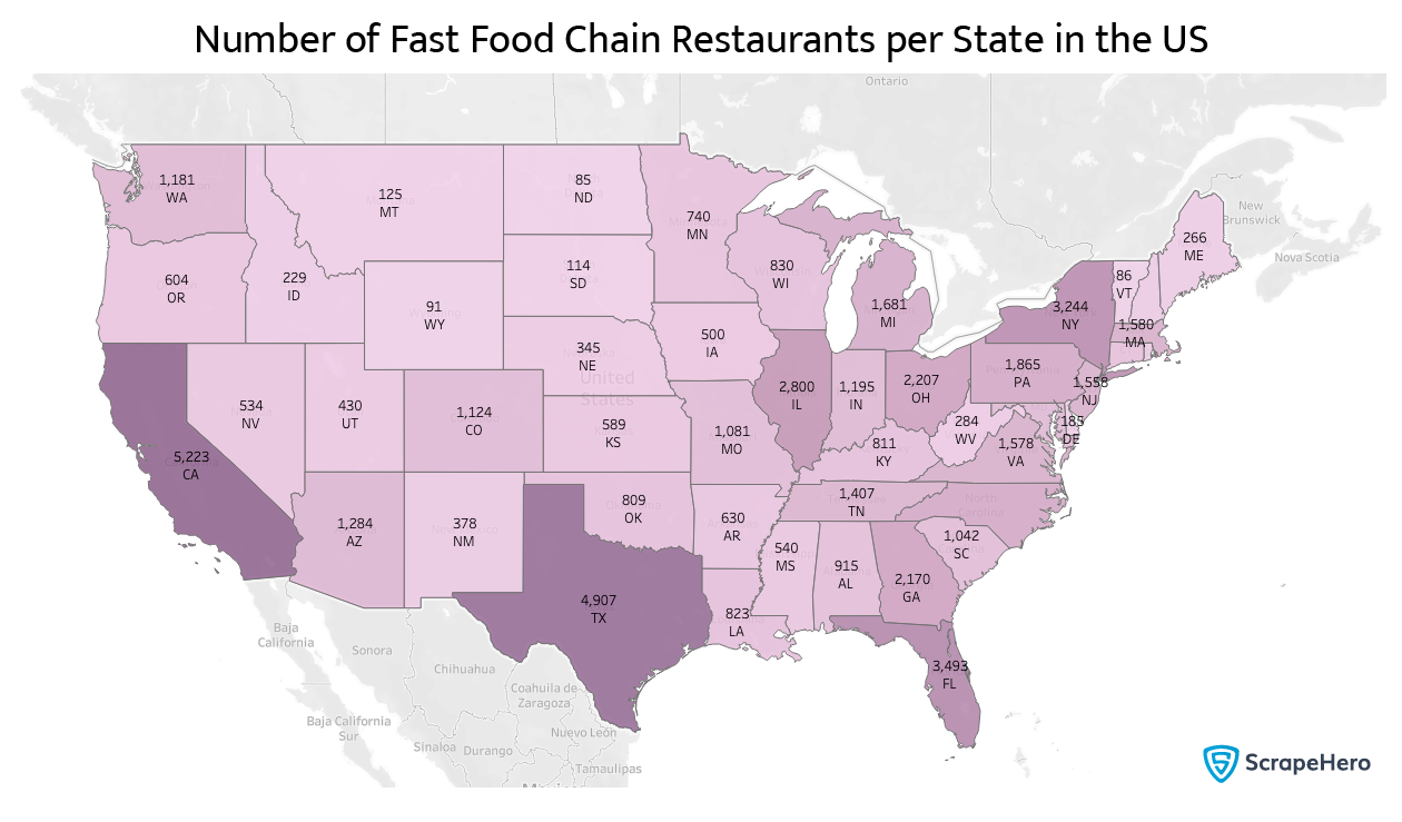
This map is much more understandable, and it’s evident that the more the state’s population, the more fast food stores we have.
Do the reviews also follow the same pattern? We can easily find that out by grouping the whole data frame by state.
df.groupby('state')['review_body'].count().compute()
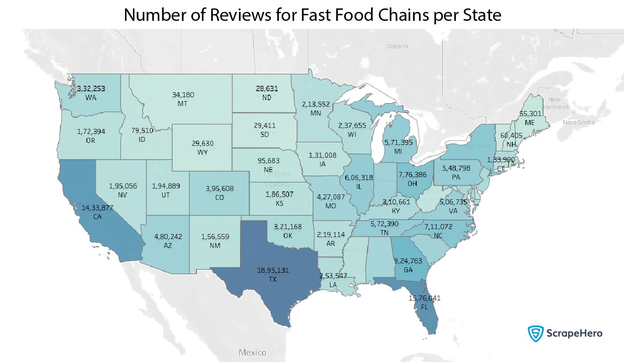
It certainly seems so.
We can now plot the reviews by date, beginning with February 2022. We just extract the month and date from the review date column to do this. This handy utility function will do the trick.
def get_year_and_month(review_date):
    return '-'.join(review_date.split('-')[0:2])

df['year_and_month'] = df['review_date'].apply(get_year_and_month, meta=(None, str))

df_temp = df['year_and_month'].value_counts().compute()
We compute the value count to find each month’s number of reviews and plot that on a graph.
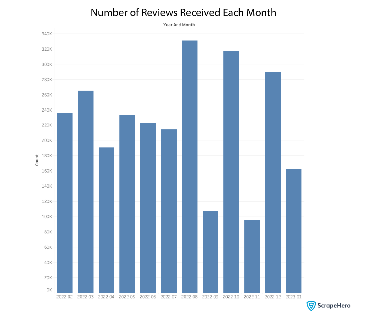
There is no obvious pattern between the date and the reviews.
Since all the reviews have a 5-point rating, we can do a mean of that value to get a general idea of how the customers feel about each fast food chain.
df.groupby('provider')['review_rating'].mean().compute()
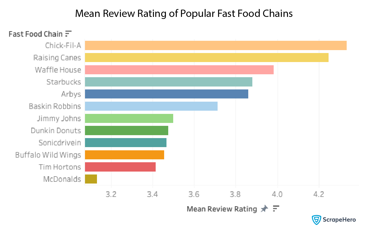
McDonald’s has a low mean review rating, whereas Chick-fil-A has the highest rating. Does the actual review text reflect this same conclusion? We will look at this in the next section.
Diving Into The Review Text
We will now look at the review text and get a general understanding of what people are saying from it. The easiest thing we can do for now is to run a sentiment analysis on the text of the reviews and try to arrive at some patterns.
We decided to go with the Vader Sentiment analysis library for this because this was the fastest sentiment analysis library we could find, which has a decent accuracy. We use this function to get the sentiment, and it outputs the label (Positive, Negative, Neutral) and a score.
def get_sentiment(row):
    review_body = row['review_body']
    worker = get_worker()

    try:
        sentiment_model = worker.sentiment_model
    except AttributeError:
        sentiment_model = SentimentIntensityAnalyzer()
        worker.sentiment_model = sentiment_model

    sentiment_dict = sentiment_model.polarity_scores(review_body)

    if sentiment_dict['compound'] >= 0.05 :
        return { 'sentiment': 'Positive', 'sentiment_score': sentiment_dict['compound'] }
    elif sentiment_dict['compound'] <= - 0.05 :
        return { 'sentiment': 'Negative', 'sentiment_score': sentiment_dict['compound'] }
    else:
        return { 'sentiment': 'Neutral', 'sentiment_score': sentiment_dict['compound'] }

output_meta = {'sentiment': str, 'sentiment_score': float }

df[['sentiment', 'sentiment_score']] = df.apply(get_sentiment, meta=output_meta, axis=1, result_type='expand')
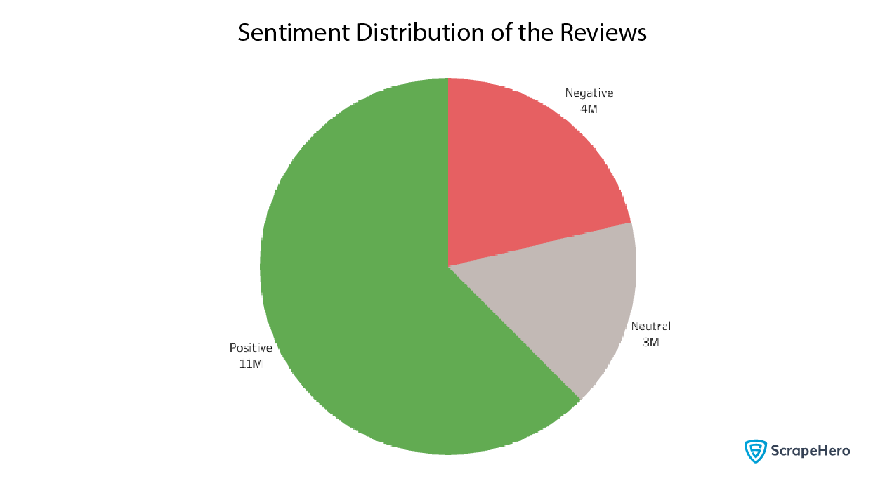
We can find how many positive, negative, and neutral reviews there are to get a general overview.
df['sentiment'].value_counts().compute()
This shows an overwhelming number of positive reviews, almost three times that of negative ones.
Which fast food chains have the most negative reviews? Since the number of reviews by different fast food chains differs, we should take the percentage here instead of absolutes. Let’s plot the positive, negative, and neutral ratios of reviews by the fast food chain.
round(df.groupby(['provider', 'sentiment'])['sentiment'].count().compute() / df.groupby(['provider'])['review_body'].count().compute() * 100, 2)
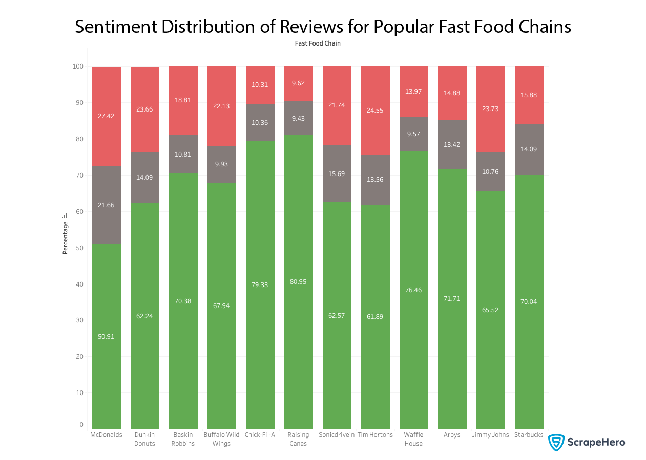
This gives us one critical insight:
Who do the Masses Favor?
Let’s dive into this a bit deeper. Which fast food chains are most and least favorably reviewed by state? We can find that out, too.
df_sentiment_grouped = df.groupby(['state', 'provider', 'sentiment'])['review_body'].count().compute()
df_provider_grouped = df.groupby(['state', 'provider'])['review_body'].count().compute()
sentiment_scores_list = []
for index in df_provider_grouped.index:
    total_reviews = df_provider_grouped[index]
    positive_reviews = df_sentiment_grouped[(index[0], index[1], 'Positive')]
    negative_reviews = df_sentiment_grouped[(index[0], index[1], 'Negative')]

    pos_percentage = round(positive_reviews / total_reviews * 100, 2)
    neg_percentage = round(negative_reviews / total_reviews * 100, 2)

    sentiment_scores_list.append({
        'state': index[0],
        'provider': index[1],
        'pos_percentage': pos_percentage,
        'neg_percentage': neg_percentage
})
df_sentiment_scores = pd.DataFrame(sentiment_scores_list)
states = df_sentiment_scores['state'].value_counts()
df_states_grouped = df.groupby(['state'])['review_body'].count().compute()
most_loved_and_hated = []
for state_code in states.index:
    most_loved = df_sentiment_scores[df_sentiment_scores['state'] == state_code].sort_values(by='pos_percentage', ascending=False).iloc[0]['provider']
    most_hated = df_sentiment_scores[df_sentiment_scores['state'] == state_code].sort_values(by='neg_percentage', ascending=False).iloc[0]['provider']
    most_loved_and_hated.append({
        'state': state_code,
        'most_loved': most_loved,
        'most_hated': most_hated,
   })
pd.DataFrame(most_loved_and_hated)
That was a long calculation, but we can finally plot the most positively reviewed fast food chains by state on a map and see.
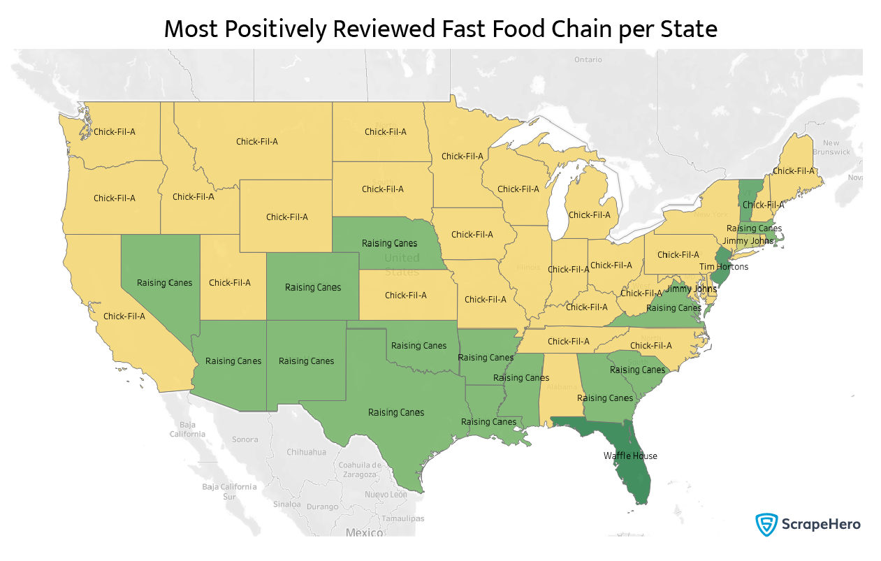
Wow! Most of the American North loves Chick-fil-A, and most of the American South loves Raising Cane’s, except Florida, which loves Waffle House the most.
What About the Least Favored Fast Food Providers?
Next, let’s plot the most negatively reviewed fast-food restaurants by state.
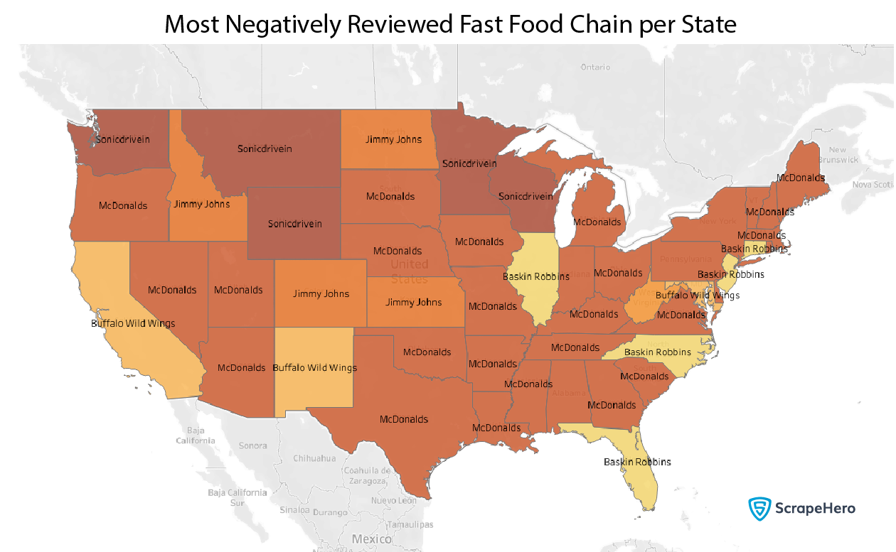
McDonald’s doesn’t seem to get much love here either, with Buffalo Wild Wings and Baskin Robbins joining the pack here and there.
Where is McDonald’s Going Wrong?
We will now try to understand the reasons behind the high negative reviews of McDonald’s. The most effortless plot here will be to plot all the negative review percentages on the map.
df_temp_all = df[(df['provider'] == 'McDonald's')]
df_temp_negative = df[(df['provider'] == 'McDonald's') & (df['sentiment'] == 'Negative')]
df_temp = round(((df_temp_negative.groupby(['state'])['review_body'].count().compute() / df_temp_all.groupby(['state'])['review_body'].count().compute()) * 100), 2)
We take the above data frame and plot it on the map.
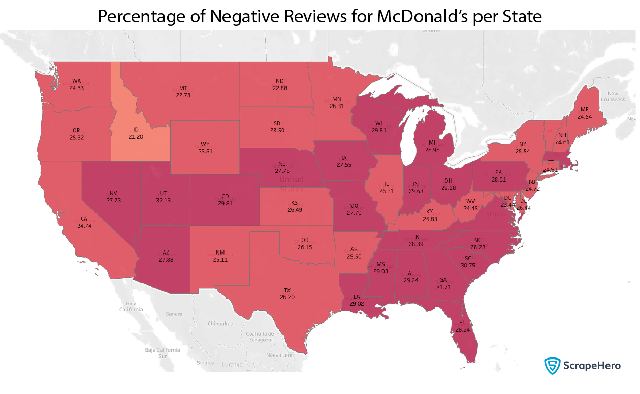
There seems to be a high concentration of negative reviews in the southeastern states.
We have to dig deeper. The next thing we can do is to classify the reviews based on the type of complaint and see the percentage of negative, positive, and neutral reviews in them.
classification_labels = ['food', 'drinks', 'service', 'manager', 'staff', 'amenities', 'wait', 'price', 'clean', 'quality', 'quantity', 'selection', 'menu', 'ambiance', 'experience', 'atmosphere']

df_provider = df[df['provider'] == 'McDonald's']

sentiment_by_label = []

for label in classification_labels:
    sentiment_obj = dict()
    df_label = df_provider[df_provider[label] == True]
    total_count = len(df_label)
    sentiments = df_label['sentiment'].value_counts().compute()
    pos_percentage = round((sentiments['Positive'] / total_count) * 100, 2)
    neg_percentage = round((sentiments['Negative'] / total_count) * 100, 2)
    neu_percentage = round((sentiments['Neutral'] / total_count) * 100, 2)

    sentiment_by_label.append({ 'label': label, 'sentiment': 'positive', 'value': pos_percentage })
    sentiment_by_label.append({ 'label': label, 'sentiment': 'negative', 'value': neg_percentage })
    sentiment_by_label.append({ 'label': label, 'sentiment': 'neutral', 'value': neu_percentage })

df_temp = pd.DataFrame(sentiment_by_label)
We ran the above code to plot it to get the following chart.
How did we get the labels? We classified all the reviews using zero-shot classification into the following aspects:
- Food
- Drinks
- Service
- Manager
- Staff
- Amenities
- Wait
- Price
- Clean
- Quality
- Quantity
- Selection
- Menu
- Ambience
- Experience
- Atmosphere
As you can see, Atmosphere, Experience, Service, and Staff have high rates of negative reviews. People are also complaining about Waiting and Service a lot.
Which aspects are the most negative reviews coming from? We drew a pie chart for that.
df_provider = df[(df['provider'] == 'McDonald's') & (df['sentiment'] == 'Negative')]
negative_reviews_count = []

for label in classification_labels:
    label_len = len(df_provider[df_provider[label] == True])

    negative_reviews_count.append({ 'label': label, 'count': label_len })

df_temp = pd.DataFrame(negative_reviews_count)
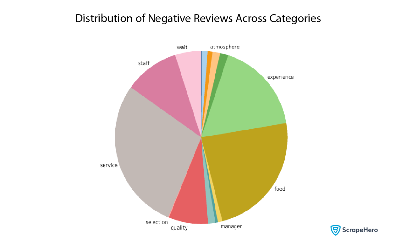
Here, we also see some of the same patterns; service and experience are among the categories with the largest number of negative reviews.
Chick-fil-A and Starbucks: What Are They Doing Right?
We now repeat the same calculations as above, except for Chick-fil-A and Starbucks, which have significantly better ratings than McDonald’s.
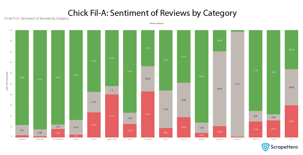
As you can see, Chick-fil-A has many more positive reviews in all categories, especially in atmosphere, experience, and staff. However, it still has the highest percentage of negative reviews for managers.
What about Starbucks? We plotted the same chart for it, too.
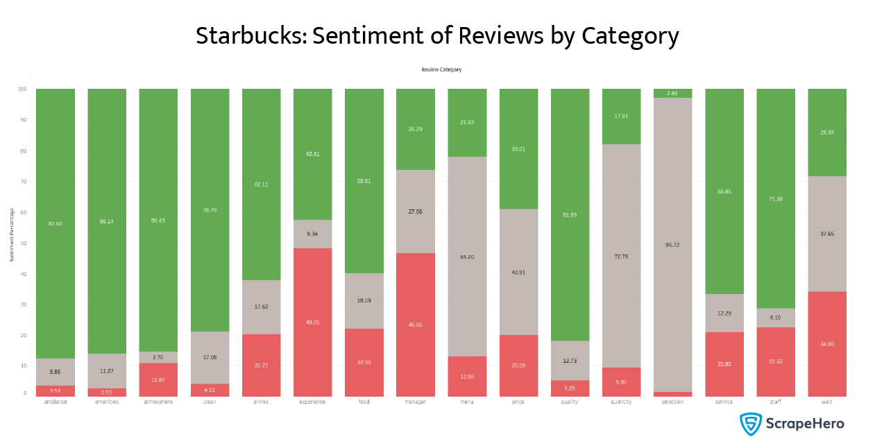
We also saw some spikes in negative review percentages for experience and manager, but other categories are overwhelmingly positive.
What separates Chick-fil-A and Starbucks from McDonald’s is that they provide a better overall experience to their customers than McDonald’s, which is causing a great difference in the review ratings.
However, regarding reviews related to managers and, to some extent, wait times, all three major fast food chains seem to have issues. It could be that as customers have issues, they reach out to the manager, hence the prevalence of the word manager in the negative reviews. Customers with a positive experience are less likely to seek out a manager or mention them.
Positive Reviews – What Makes Fast Food Chains Click?
Much has been said about negative reviews of fast food chains till now. What about positive reviews? We will try to answer what aspects people love the most from each of our fast food chains.
We take all the positive reviews of all the fast food chains and find the percentage of reviews that belong to which aspect.
df_positive_reviews = df[df['sentiment'] == 'Positive']
providers = df['provider'].value_counts().compute().index
provider_positive_reviews_by_labels = []

for provider in providers:
    df_provider = df_positive_reviews[df_positive_reviews['provider'] == provider]
    label_count = []

    for label in classification_labels:
        len_label = len(df_provider[df_provider[label] == True])
        label_count.append(len_label)

    for i in range(len(label_count)):
        percentage = round((label_count[i] /  sum(label_count)) * 100, 2)
        provider_positive_reviews_by_labels.append({ 'provider': provider, 'label': classification_labels[i], 'percentage':  percentage })

    print('Done for: {}'.format(provider))

df_temp = pd.DataFrame(provider_positive_reviews_by_labels)
We plot that as a stacked bar plot, as shown below.
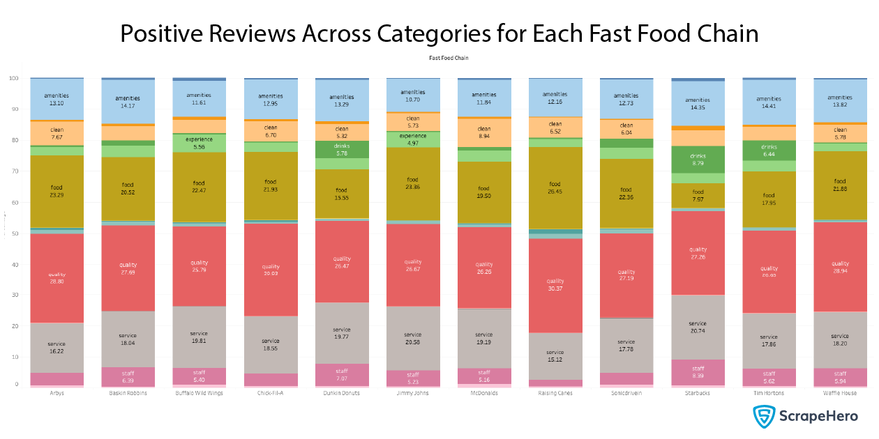
It seems that Dunkin Donuts and Starbucks are differentiating from others in the positive reviews of the staff. For service, Jimmy John’s and Starbucks fare way better than the average for services.
Raising Cane’s has received many positive reviews on food, while Dunkin Donuts, Starbucks, and Tim Hortons have been acknowledged more for drinks.
Wrapping Up
Thanks to modern machine learning and analysis techniques, we could dive deep into the review text and get an idea of what makes a fast food restaurant stand out. The key is giving a great experience with decent amenities, service, and tolerable wait times.
However, one thing that consumers are uncompromising about is the quality of food, and the restaurants that keep that in mind are appropriately rewarded.
Interested in the 30 million rows of data that went into this analysis? Then, contact ScrapeHero.