This tutorial will provide step-by-step directions on how to visualize location data from The ScrapeHero Data Store as a choropleth map using the open-source GIS software QGIS.
Visualizing the number of locations by State as a Choropleth map
Choropleth maps are the most popular category of thematic maps. They are highly effective when the geospatial data is associated with some enumeration units (Counties, provinces, districts, etc.).
In a choropleth map, the different polygons in a layer have various shades of a color representing a particular attribute (number of locations in our case) of that polygon.
We will create a choropleth map of the United States, where each state is color graded proportionate to the number of locations in that state.
The main steps for creating the Choropleth map are:
- Import the polygon vector map
- Import the ScrapeHero CSV file as a point vector
- Calculating the number of locations within each state using ‘Count Points in Polygon’ tool
- Edit the symbology to get Choropleth map
- Export the map as an image or PDF
If you prefer to watch a video on how to do this, instead of reading through the long tutorial, we’ve got that covered. 🙂
Import the polygon vector map
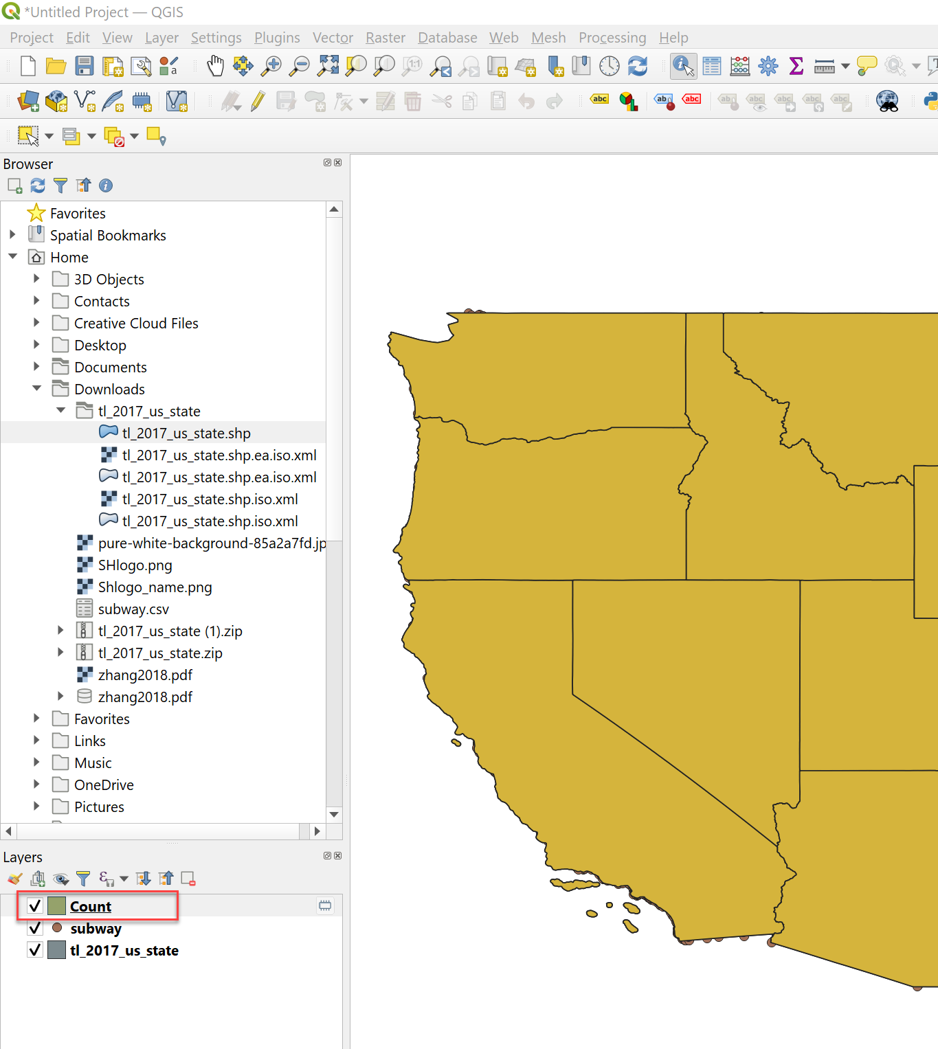
To get a Choropleth map, we first need to get a polygon vector map of the country/region. For the United States, we can download the polygon shapefiles from data.gov.
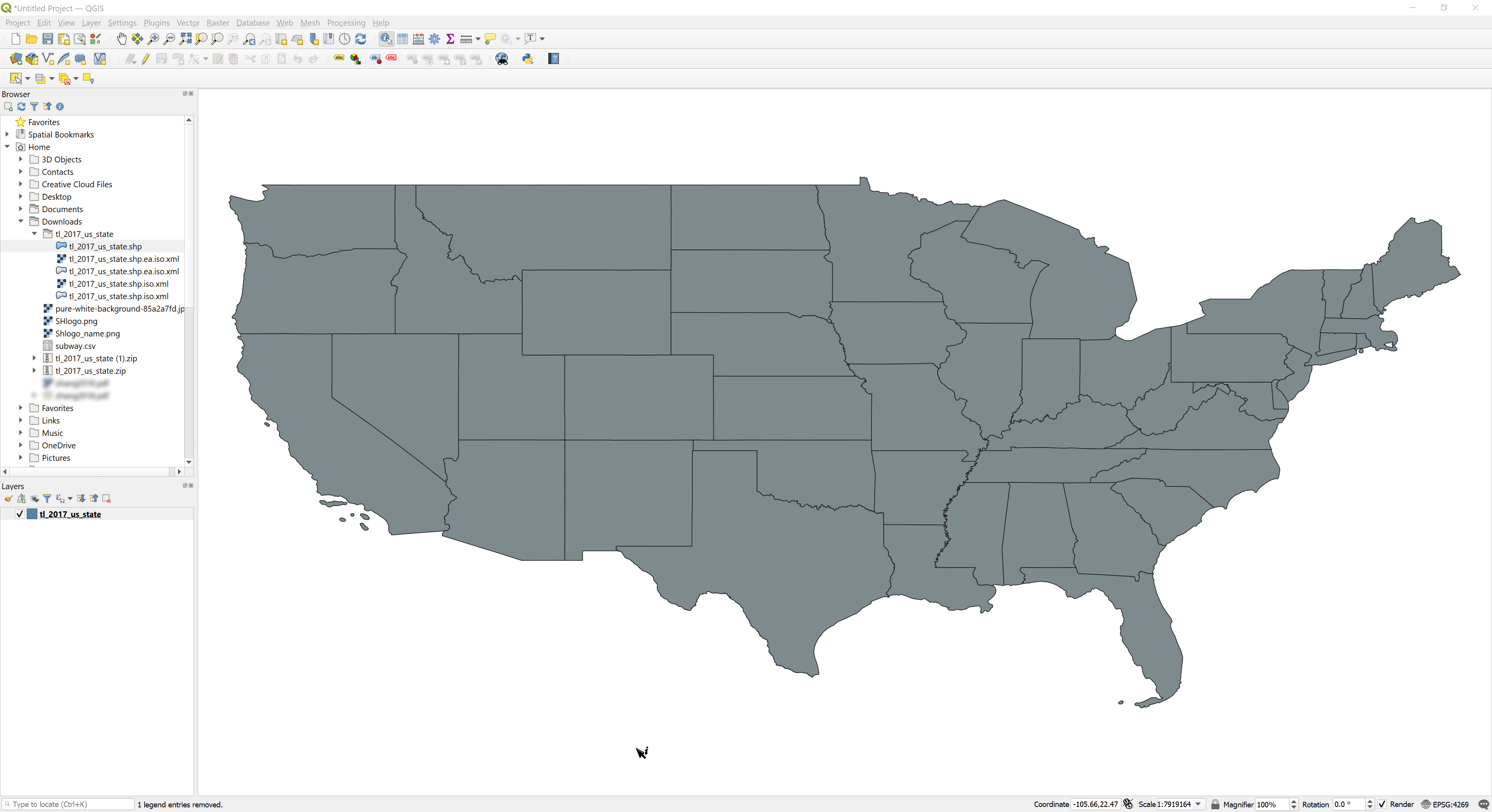
Here, each polygon in the vector map represents a state in the US. Download the compressed shapefiles and extract the files from the compressed folder. Add the file with the .shp extension to QGIS from the Browser toolbar by double-clicking (or dragging and dropping).
The polygon layer will appear as shown below:
Import the ScrapeHero CSV file as a point vector
We will use one of the store location datasets from the ScrapeHero Data Store. For this tutorial, we will use the complete list of Subway store locations in the United States. This data contains each store’s latitude and longitude coordinates, which you can plot as points over a map. You can download a sample CSV file or buy the full data from the link below.
Each record in the CSV file from ScrapeHero has the fields Latitude and Longitude, based on which we can plot the points on the map.
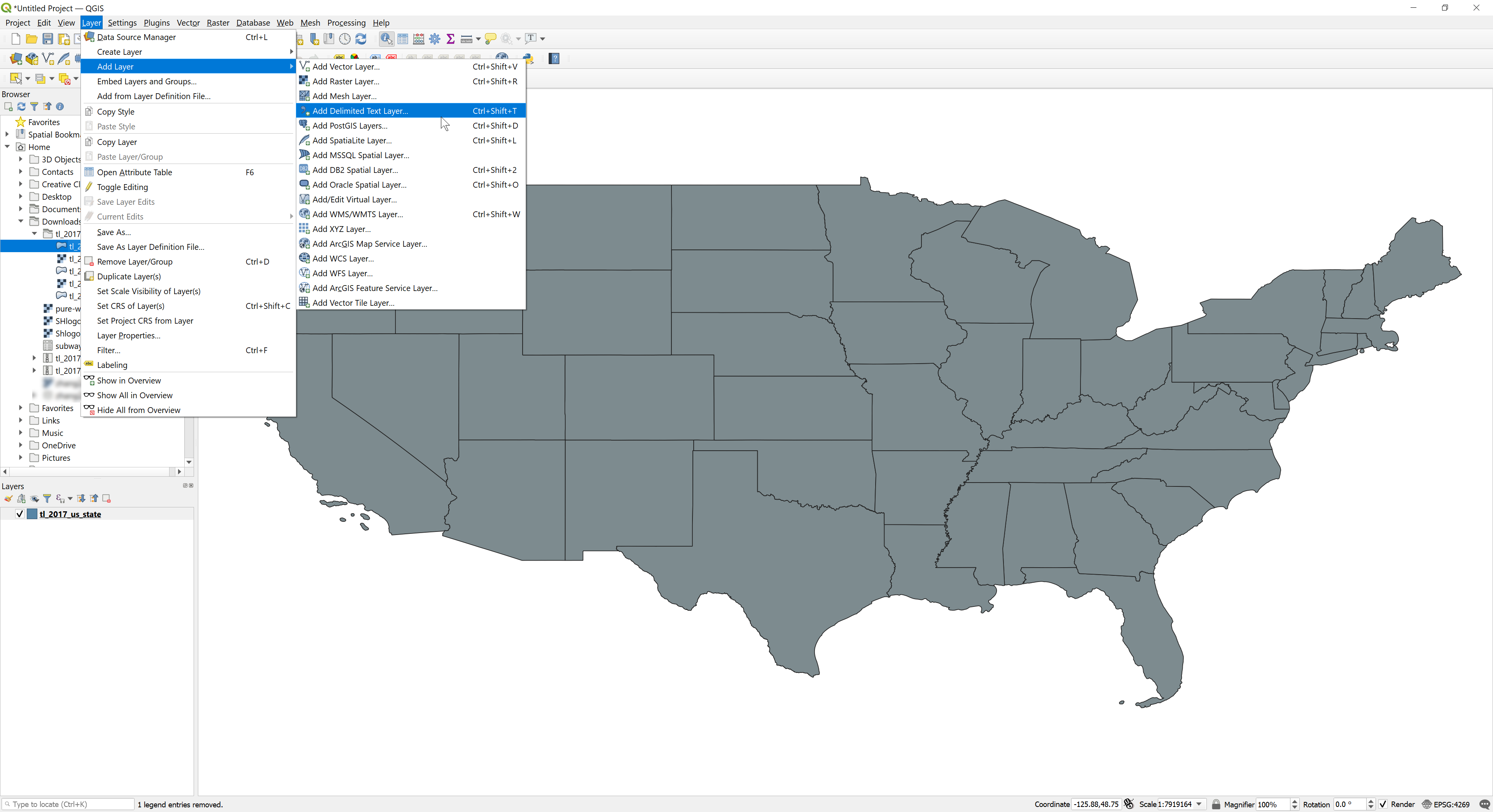
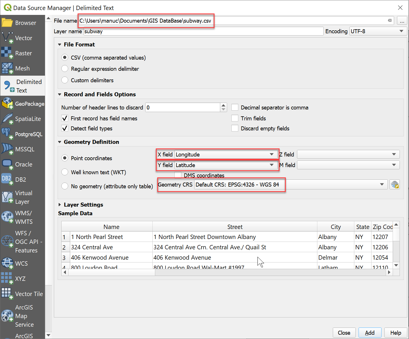
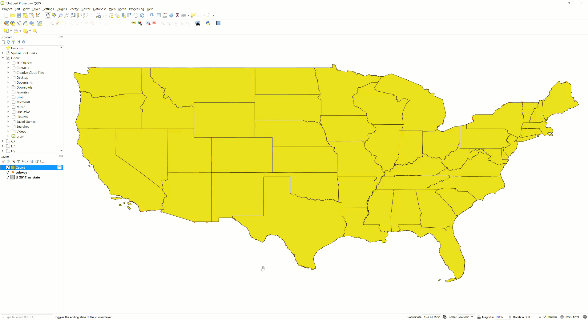
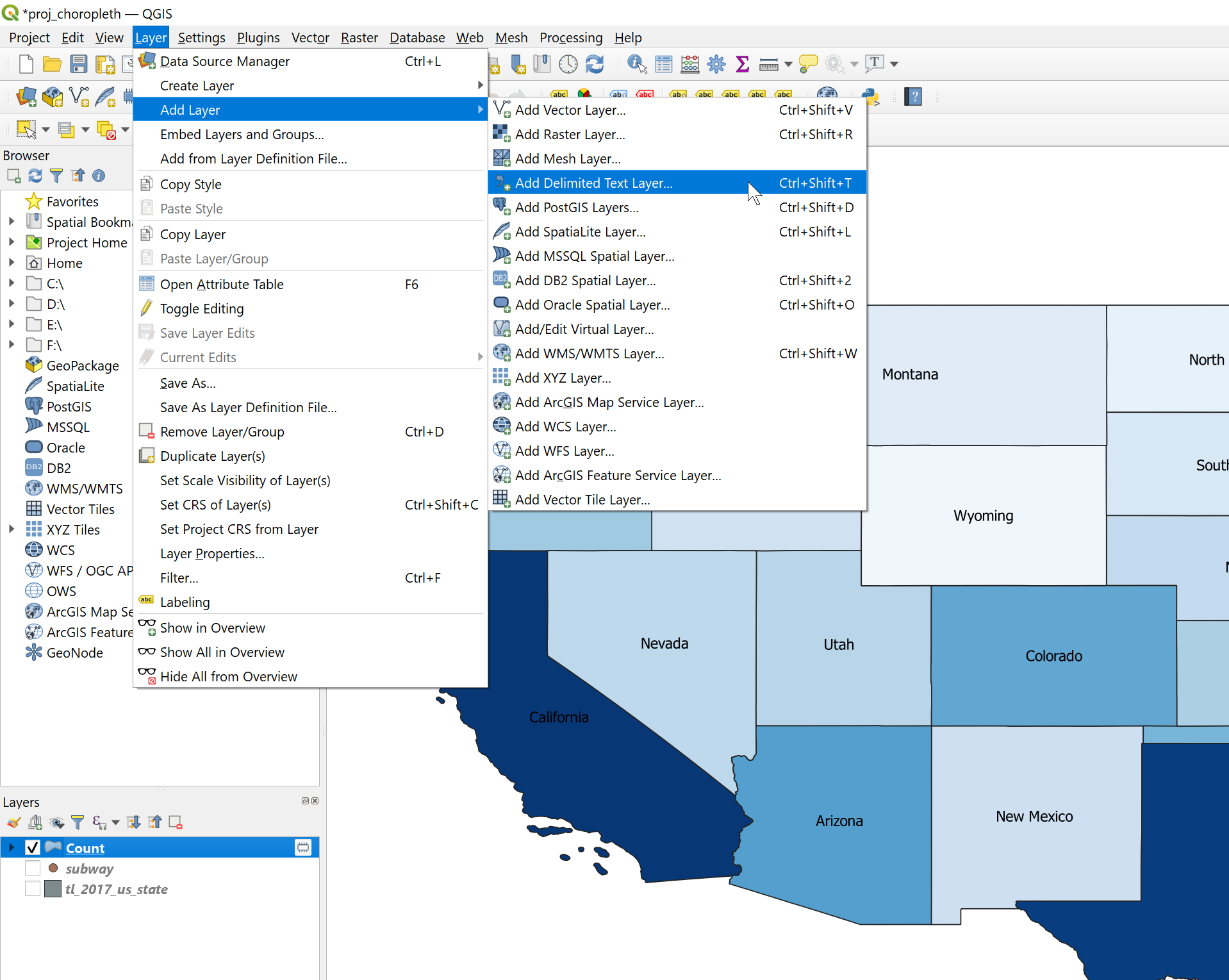
Go to the Layers tab from the main toolbar, select Add layer > Add Delimited Text Layer
In the ‘Data Source Manager’ window that pops up, browse for the ScrapeHero CSV file as File name. Select the Longitude and Latitude as X field and Y field, respectively. Also, select the respective Geometry CRS (coordinate reference system) based on the area or country used. For The United States, EPSG 4326 – WGS 84 is generally used.
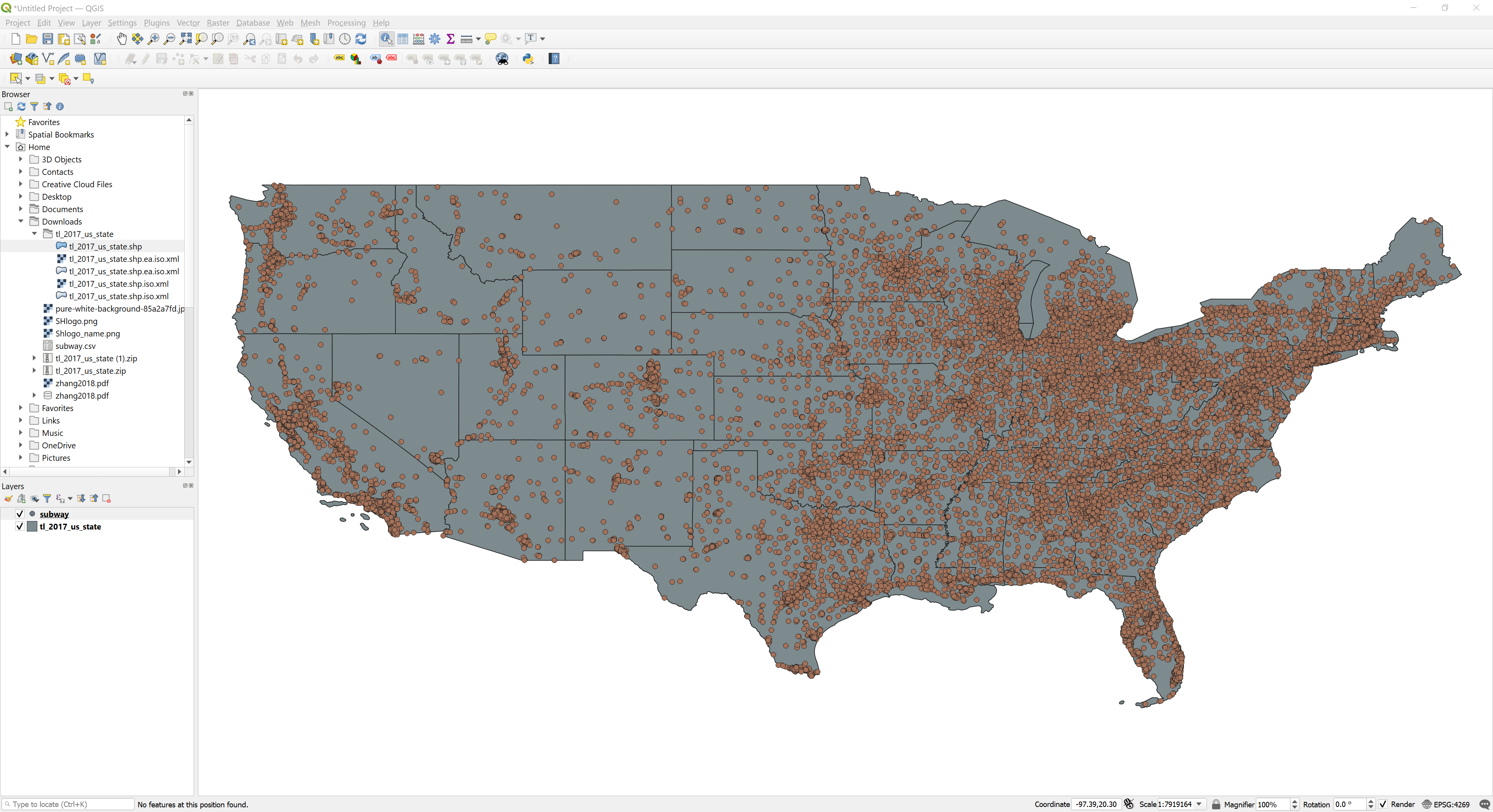
The Add button plots the different store locations in the CSV as points over the polygon layer. The layer appears as shown below:
Calculating the number of locations within each state using ‘Count Points in Polygon’ tool
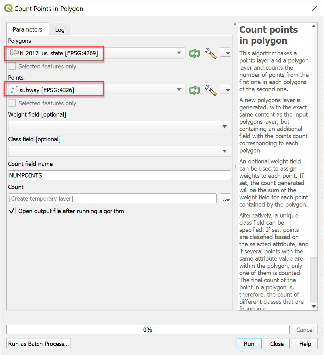
To represent the number of locations within each state, the QGIS tool ‘Count Points in Polygon’ can be used. This tool creates a new polygon vector shapefile with a new attribute, ‘NUMPOINTS’. It gives the number of points falling in a polygon.
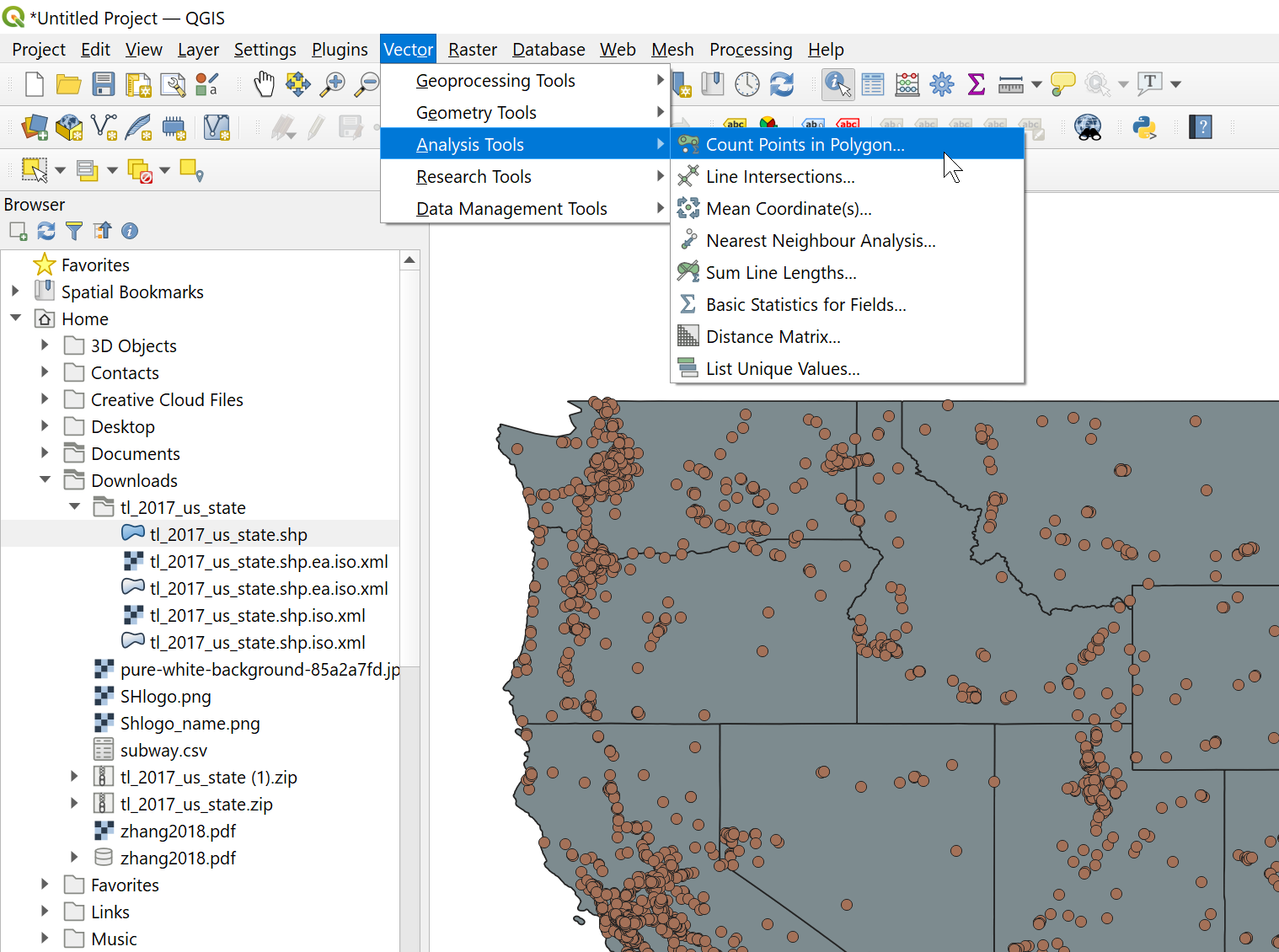
Browse through Vector toolbar> Analysis tools> Count Points in Polygon.
The following window appears. Set the polygon shapefile layers as ‘Polygons’ and the store location point vector file as ‘Points’. An attribute ‘NUMPOINTS’ will be created for the polygon shapefile, representing the number of locations in each state.
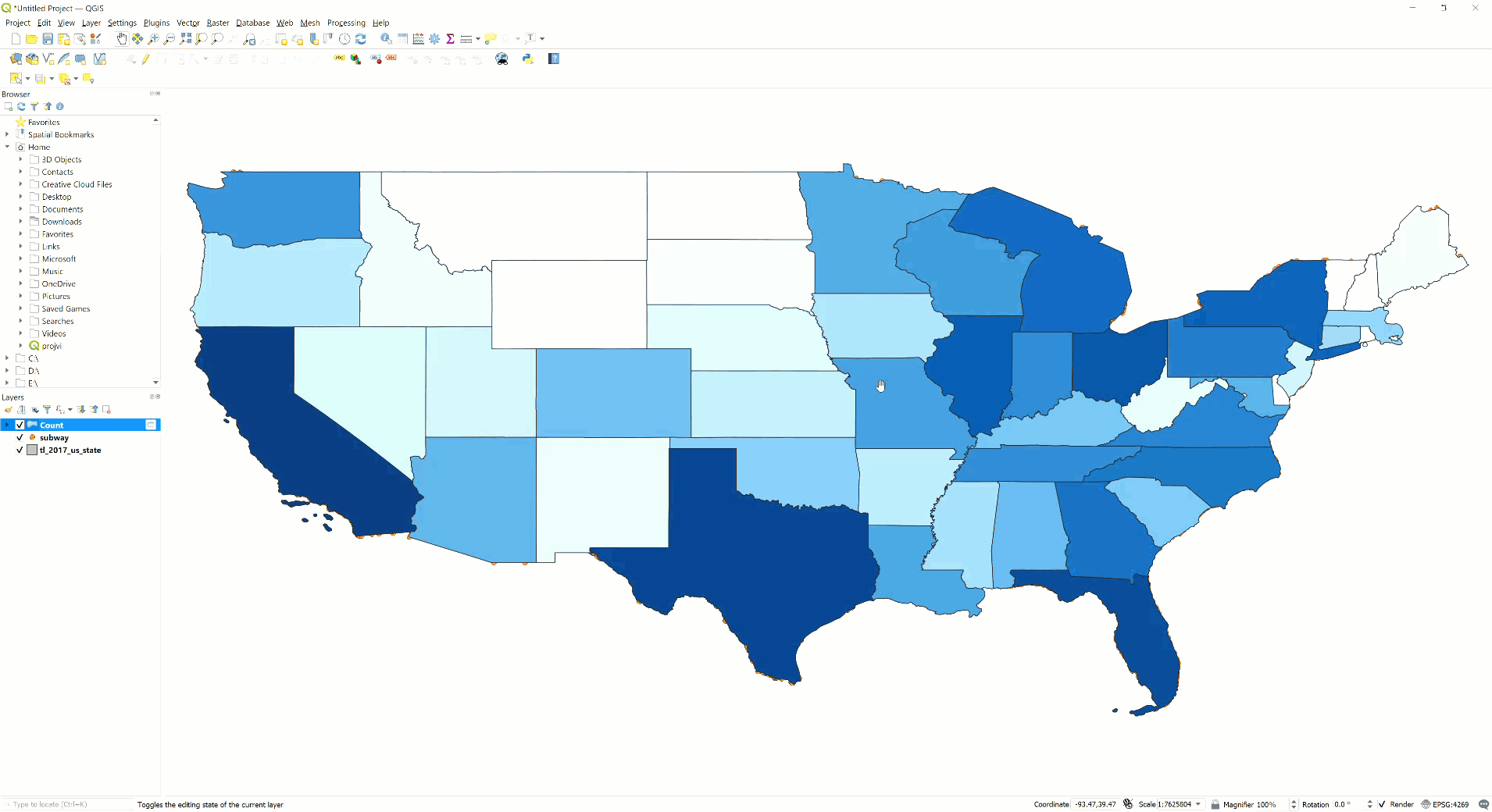
A new layer is created named ‘Count’, and it appears in the layers tab and in the image canvas area:
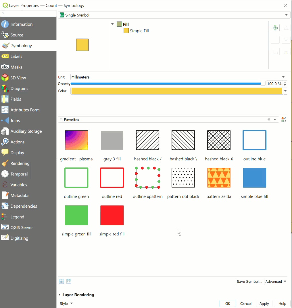
Edit the symbology to get a Choropleth map
The new layer’s symbology can be configured to get the proportionally graded colors that represent the number of locations in each state.
Right-click the Count layer, select properties, and go to the Symbology tab
From the symbology menu, select ‘Categorized’. Set the Value of symbology to the newly created attribute ‘NUMPOINTS’. Click ‘Classify’ and then select the appropriate color ramp:
After editing the symbology, the map appears as shown below:
Each state can also be labeled their corresponding names on the map.
Right-click the Count layer, select properties, and go to the Label tab.
From the label menu, select ‘Single Labels‘ and then the ‘Value‘ field from the table as the label. Here, the ‘NAME’ of the states are labeled corresponding to each polygon. Configure the font, font color, font size, opacity, and other attributes as you like.
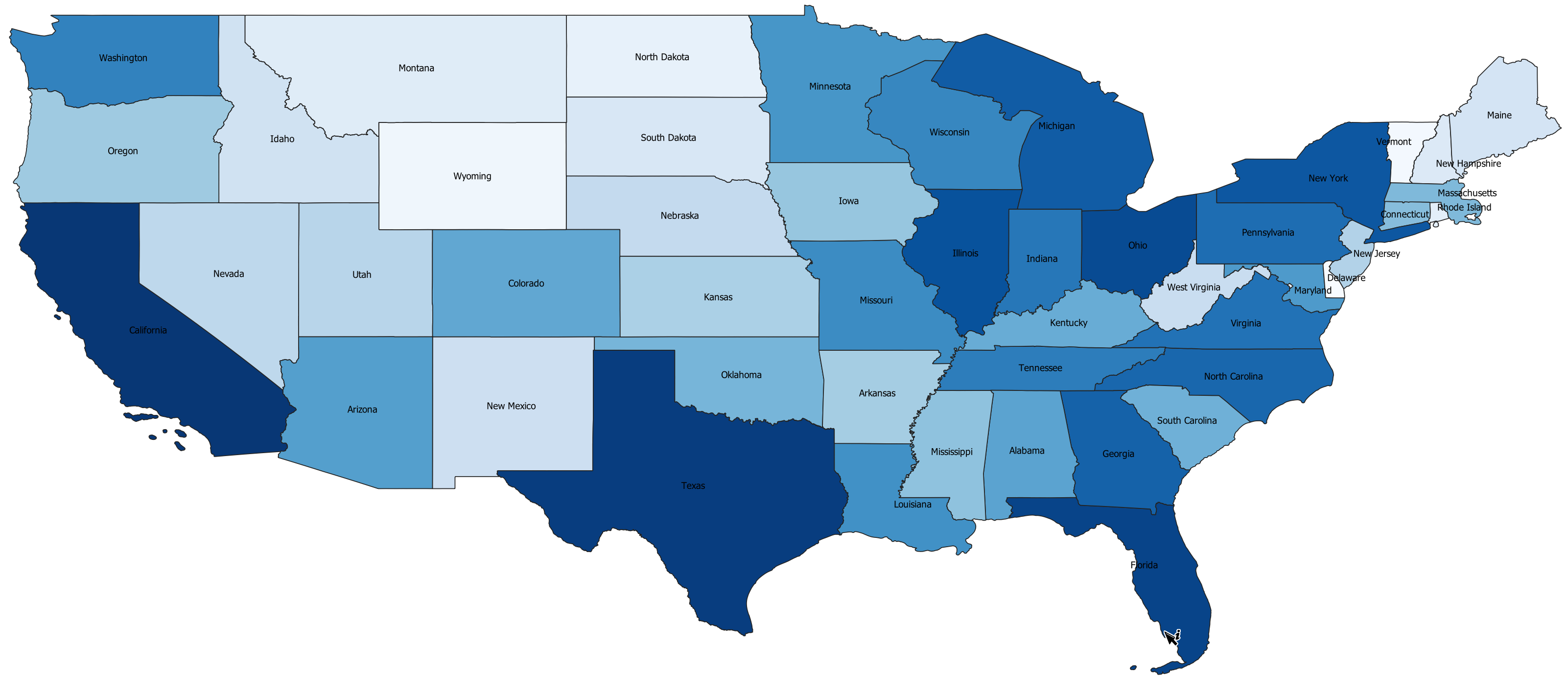
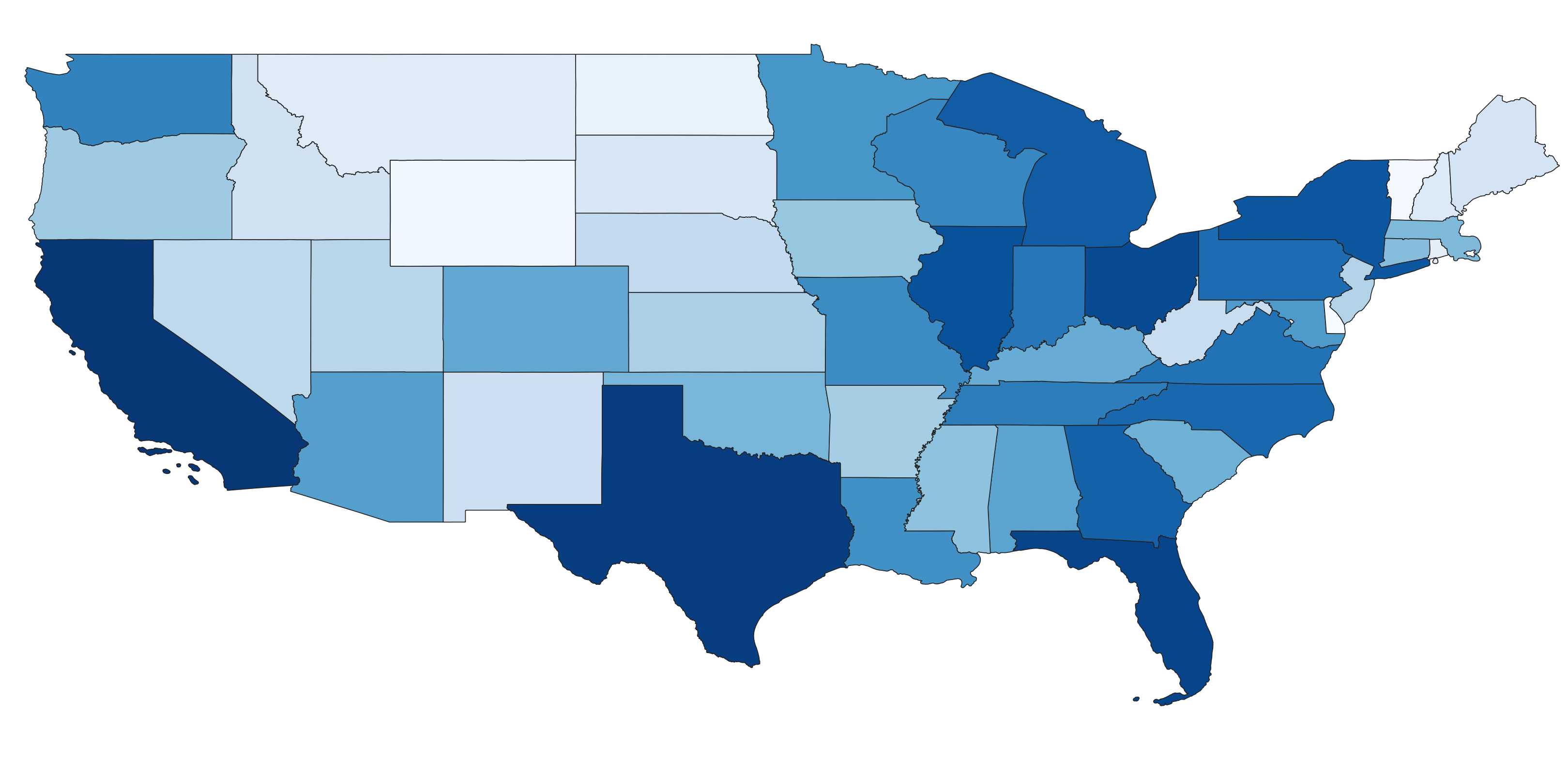
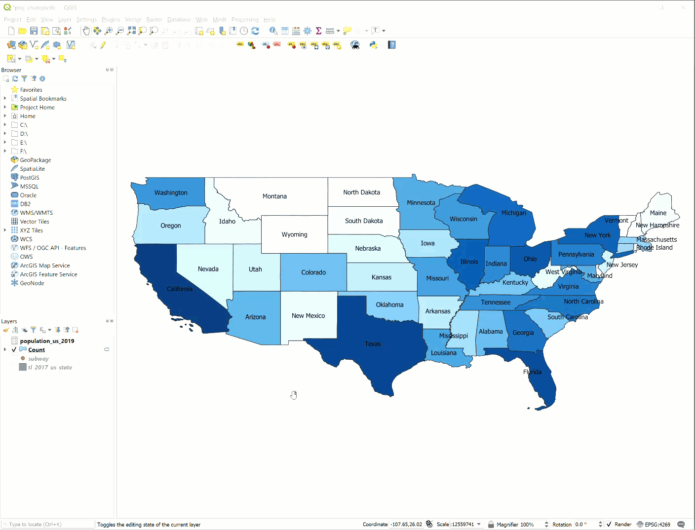
The final map appears as shown below. Darker shades of blue represent states that have a greater number of locations of the particular provider considered.

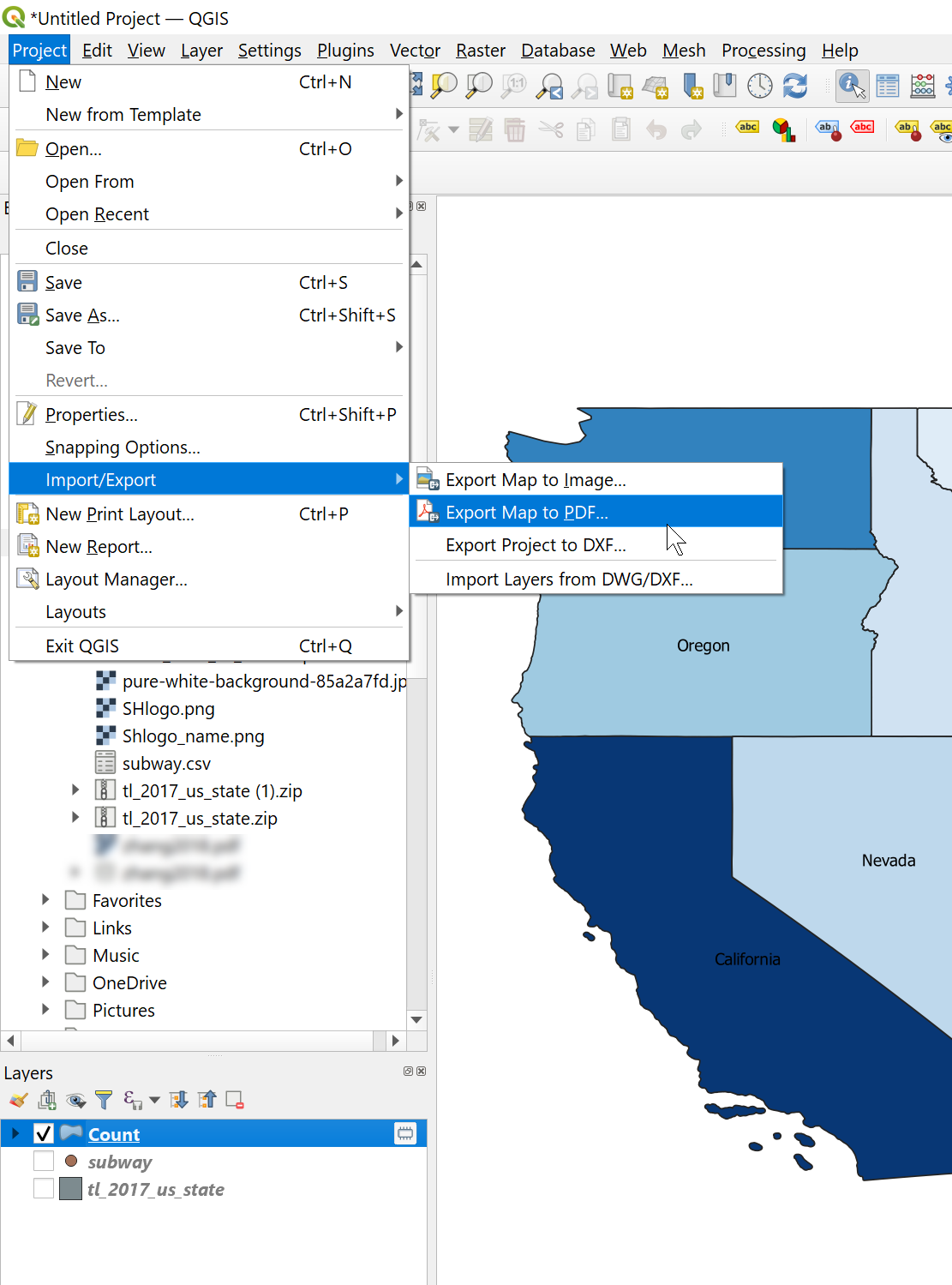
Export the map as an Image or PDF
Go to Project> Import/Export > Export as Image for png format or Export as PDF to get the final map in PDF format.
The above choropleth can be used to compare each state based on the number of subway stores in it.
But, it is very similar to the population choropleth of the United States.
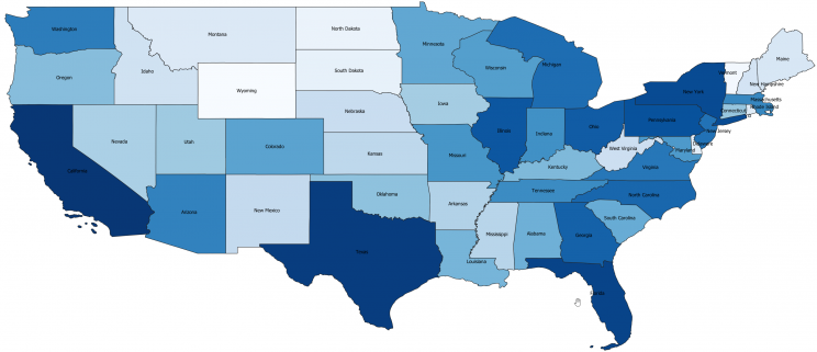

This happens because the number of stores in each state is often highly correlated with the population i.e., the states with greater population will have a greater number of stores.
To get more insightful choropleth, we can compute a new statistic- ‘the per capita‘ locations by state. This variable represents the adequacy of stores in a state. A state with a higher value of population can still have a lesser number of stores.
Visualizing the number of locations per person (per capita) for each state in the US
We can create a choropleth of the per capita locations of subway using the population data by following the steps below:
- Create a CSV file of the required population data
- Import the CSV file to QGIS
- Join the population data with attribute table of the map layer
- Perform field calculations to get the number of locations per person
- Create choropleth map based on the new statistic
Create a CSV file of the required population data
The population data of the United States be downloaded from the Census Bureau’s website. The excel file contains population estimates for each state for corresponding years. The name of the state and its corresponding population estimates for the year 2019 can be saved into a new file.
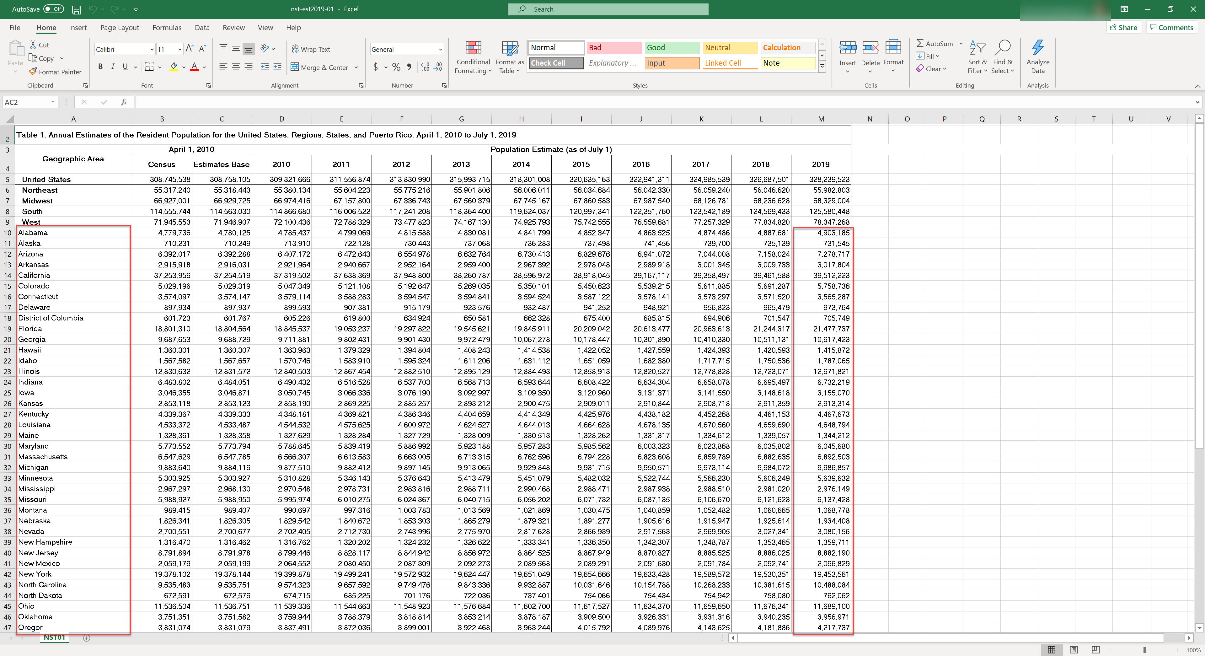
The new file is shown below:
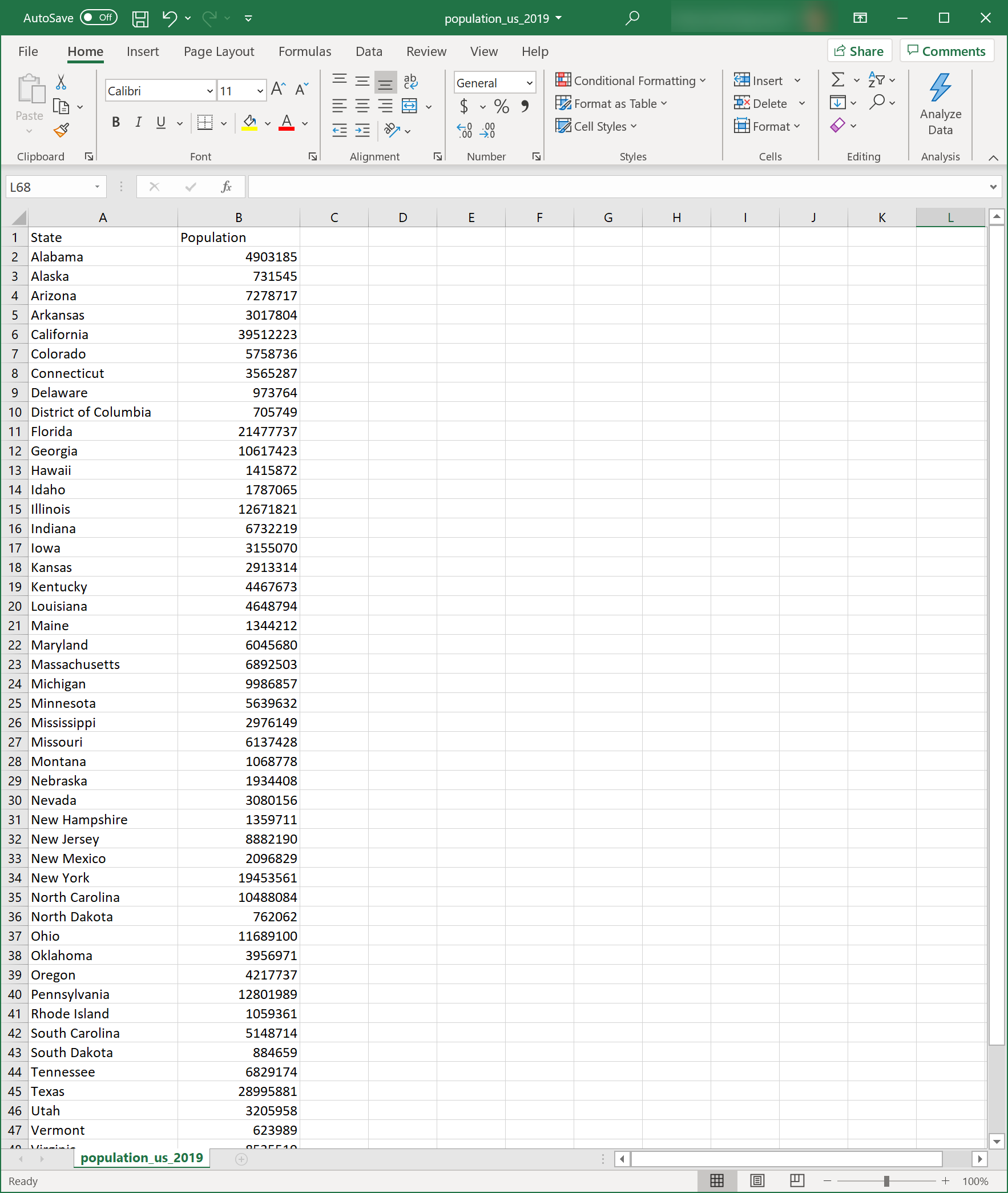
Ensure that the population column type is ‘Number’ so that QGIS reads the field as number type and later, analysis can be done based on population. Select the Population column > Right-click > Format cells, and check if the category is number. Save the file in CSV format.
Import the CSV file to QGIS
To import the CSV to QGIS
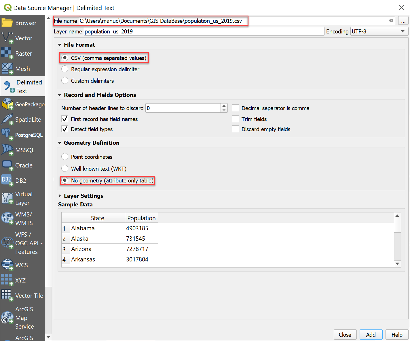
Goto Layer > Add layer > Add Delimited Text Layer
The CSV file is added to QGIS without geometry and appears as a table in QGIS.
Right-click the new table layer- population_us_2019 > open attribute table to see the contents of the layer:

Join the population data with attribute table of the map layer
To join the population data to the ‘Count’ layer;
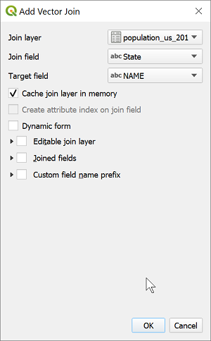
Right-click on the ‘Count‘ layer > Properties > Joins > click Add icon
Select the population table as ‘Join Layer‘. Select the name of states in the population table as ‘Join field‘ and the same in the map layer as ‘Target field‘. Make sure that names in both layers match perfectly. Mismatched fields will not be joined.
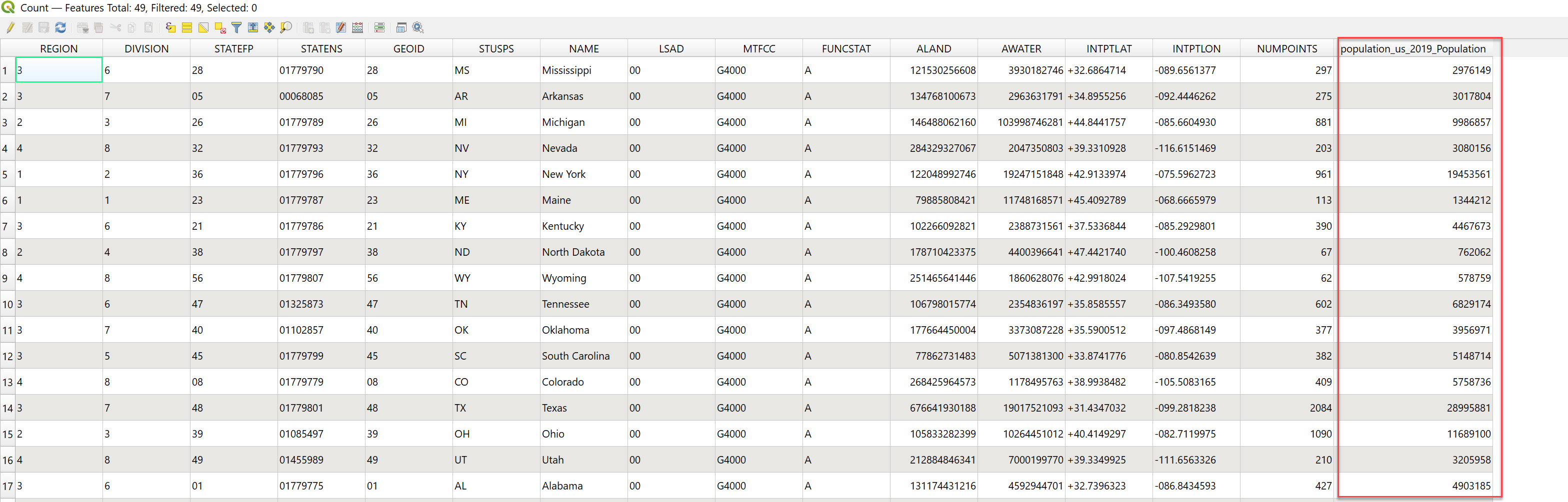
Open the attribute table of the ‘Count‘ layer and check if a new field is added to the attribute table with population estimates of each state.
Perform field calculations to get the per captia number of locations
The per capita number of locations can be estimated by performing division operation in the attribute table. We have two columns in the attribute table of the ‘Count’ layer representing the number of locations (NUMPOINTS) and the population (population_us_2019_Population). To get number of locations per person by state;
Right-click on the ‘Count‘ layer > Open attribute table > Click Open field calculator icon from the menu bar
From the window that pops up, select Create a new field option. This creates a new column in the attribute table for the computation result. Provide an Output field name and select the Output field type. Here Decimal number(real) was selected and also a higher value for precision was given since the value of population was very high compared to the number of locations. Provide the equation ‘NUMPOINTS / population_us_2019_Population‘ below the Expression tab and click OK.
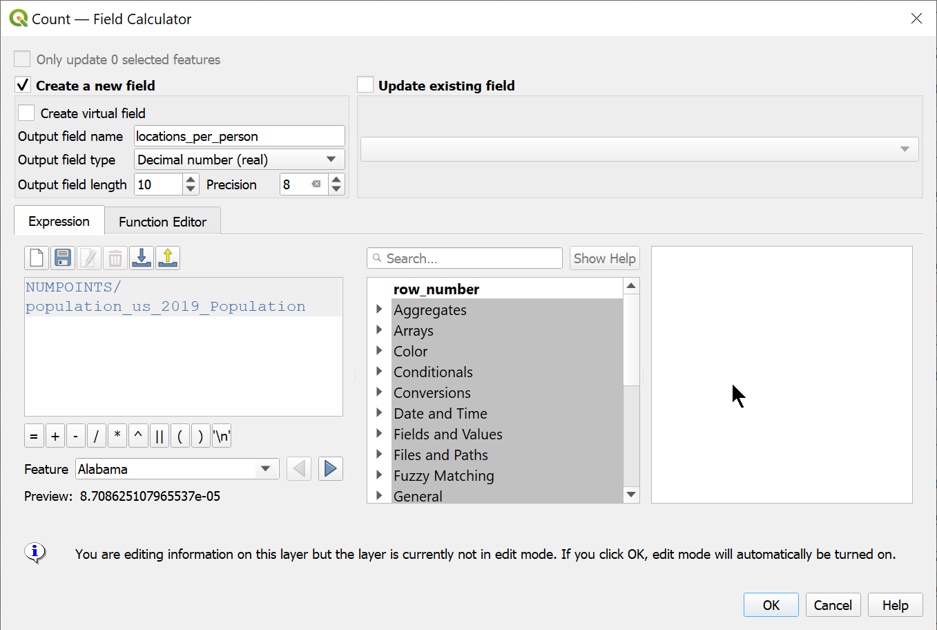
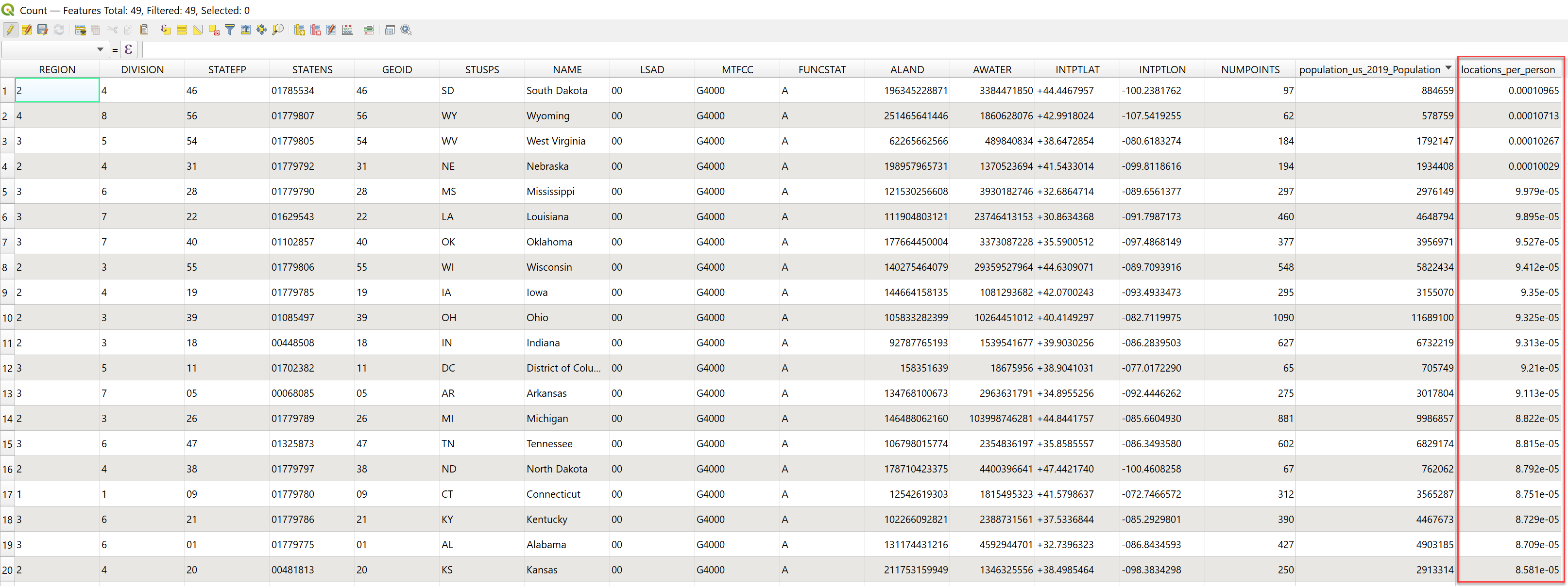
The attribute table is now updated with a new column, locations_per_person. This value is the estimate of the number of locations available per person in each state. This value is used to get the new choropleth map.
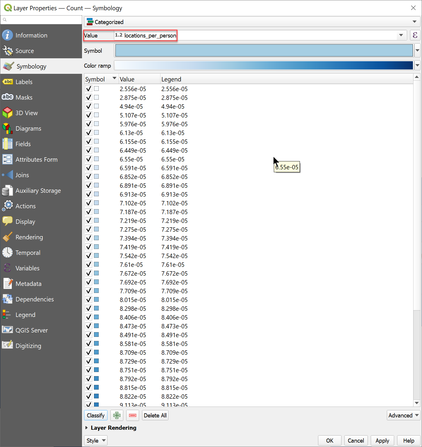
Create choropleth based on the new statistic
Again, edit the symbology of the ‘Count‘ layer as mentioned earlier, and this time assigning ‘locations_per_person‘ as the ‘Value‘ for symbology.
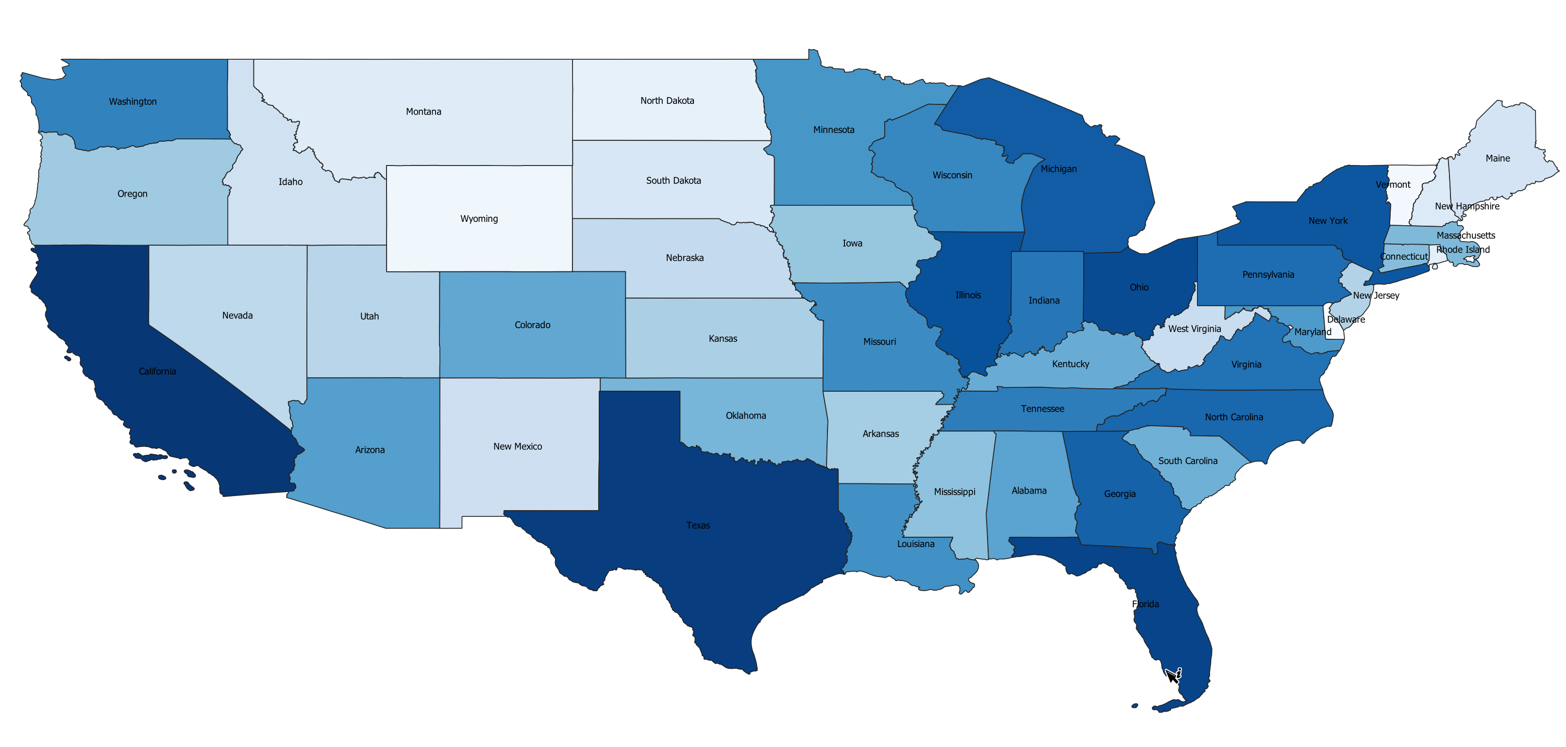
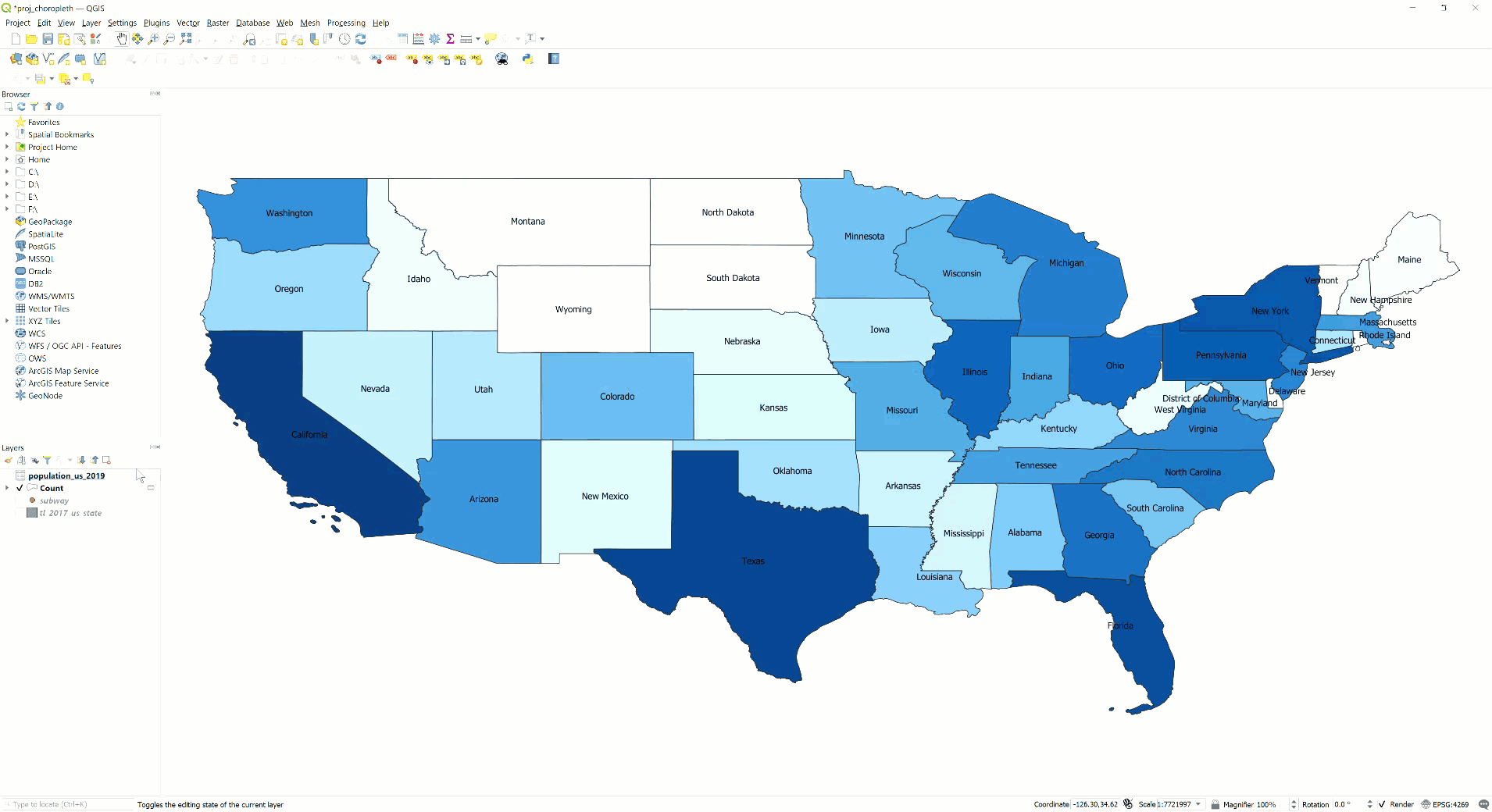
The new choropleth for the number of subway stores per person by state is as obtained:
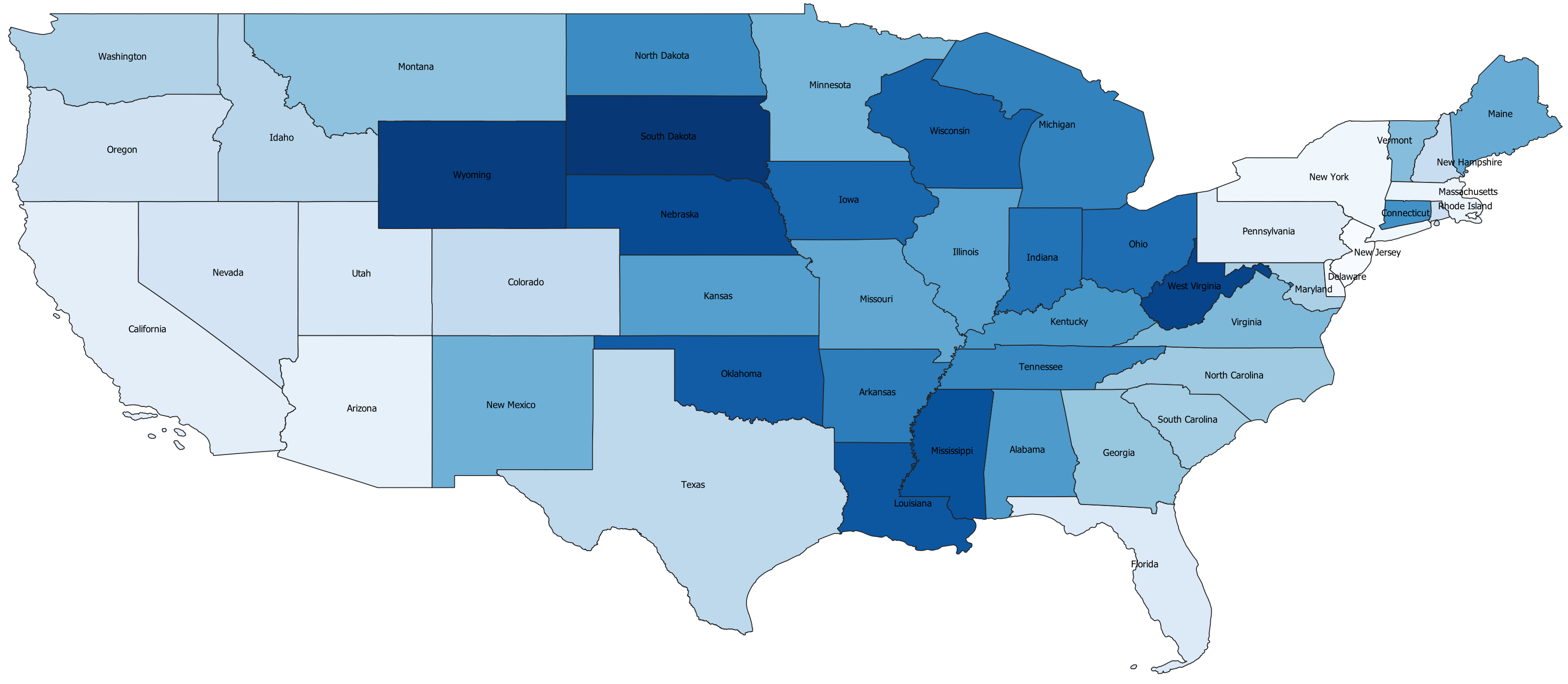
This time, the map is much different from that obtained previously.


Here, we can observe that although states like Texas, California, New York, and Florida have a greater number of subway stores; the number of locations per person is less. That is, these states are still in short of the subway stores when the population is considered.