Choosing the best data visualization tool is a big decision. The right tool will make your life better. The wrong one can be a costly and frustrating mistake.
We get it.
The secret that many won’t tell you is this: the “best” tool doesn’t exist!
The real goal is to find the best tool for you. The best fit for your team’s skills, your company’s budget, and the specific stories you need your data to tell.
We’ve cut through the hype to give you a clear, honest, and practical comparison. We’ll help you move from feeling overwhelmed to feeling completely confident in your choice.
A Quick Thought Before We Start:
A great dashboard needs great data. Sometimes the most valuable data isn’t in your files, but on the web, like competitor prices or market trends.
But collecting this data can be a bit complex for people with no web scraping experience.
Many teams find it easier to use an outsource web scraping service like ScrapeHero. We handle the technical part, so you can focus on finding insights.

Ready to find your match?
How to Find the Best Data Visualization Tool for You?
First, let’s be clear about what we’re discussing.
What are Data Visualization Tools?
In simple terms, data visualization tools are software that turns numbers into pictures. They take data from spreadsheets or databases and create charts, graphs, and dashboards. This helps you see patterns and understand stories in your data that are hard to spot in a table of numbers.
Now, how do you pick the right one? You don’t need to be an expert. You just need to ask a few key questions.
Follow these five simple steps to find your perfect match:
- Consider Who Will Use it
- Be Clear About the Total Cost
- Check Where Your Data Lives
- Define What You Want to Achive
- Look for Helpful Automation
1. Consider Who Will Use It
Is this for a data expert, a business manager, or everyone? Some tools are built for technical users who want deep control. Others are designed for simplicity, so anyone can build a report. Choose a tool that matches the skill level of your team.
2. Be Clear About the Total Cost
Look beyond the sticker price. Some tools have a free version, but charge for advanced features or for each person who just views a report. Understand all the costs to avoid surprises later.
3. Check Where Your Data Lives
Your tool needs to connect to your data. Can it easily pull information from your sources? Common sources include Excel, Google Sheets, databases, or cloud storage. Make sure the tool you choose plays nicely with your systems.
4. Define What You Want to Achieve
What is your main goal? Do you need interactive dashboards for daily monitoring? Do you need to explore data to find new insights? Are you creating formal reports to share with clients? Your primary goal will point you to the right type of tool.
5. Look for Helpful Automation
Many modern tools now have AI features. These can automatically spot trends or let you ask questions about your data in plain English. If this sounds helpful, prioritize tools that offer it.
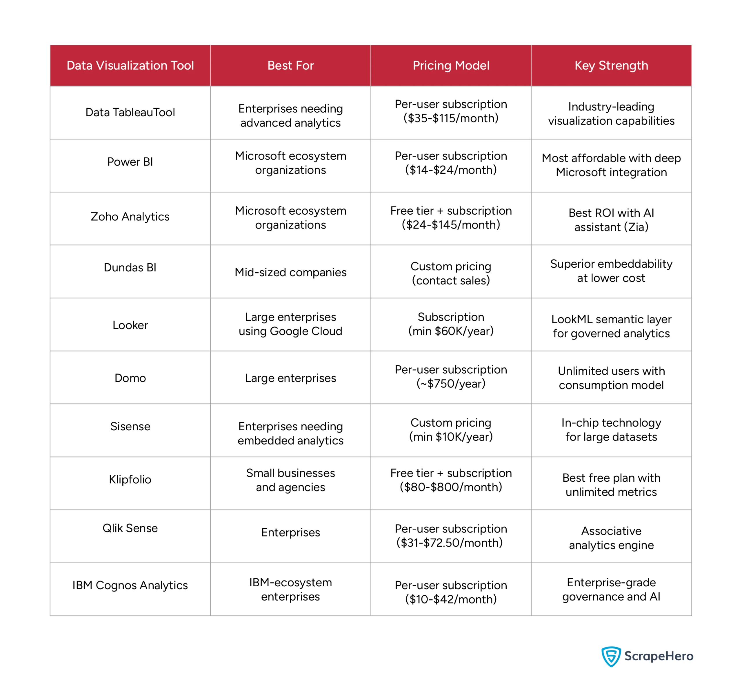
The Top Data Visualization Tools for 2025: At a Glance
Now, let’s meet the contenders. We’ve reviewed the market to bring you this list of the top data visualization tools in 2025.
The table below gives you a quick snapshot for easy comparison. It highlights the best use case, pricing style, and key strength for each platform.
The Top Data Visualization Tools for 2025: In Detail
Now, let’s take a closer look at each contender. A quick summary is helpful, but the real decision comes from understanding the details.
In this section, we break down each of the best data visualization tools one by one. We go beyond the basic features to give you a clear picture of what it’s really like to use them every day.
1. TABLEAU
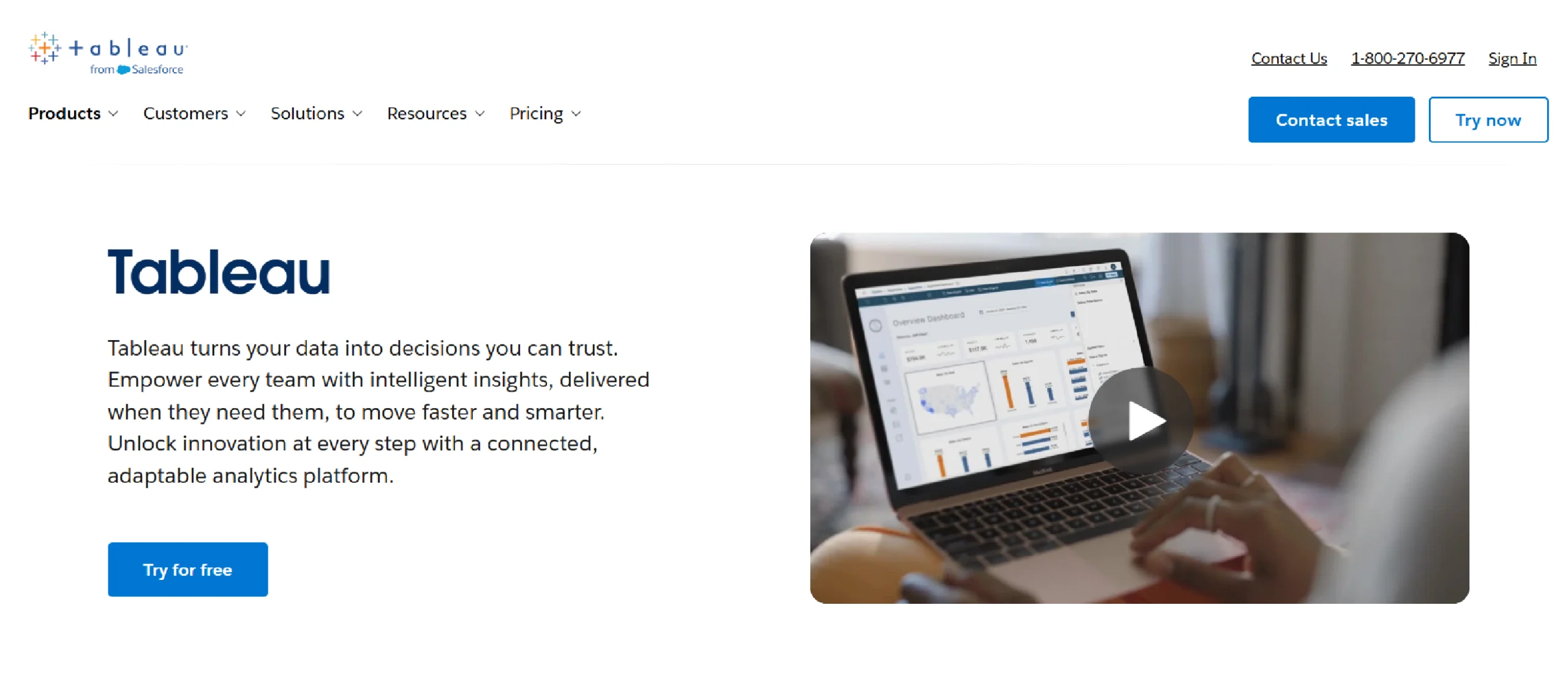
Tableau is an industry-leading tool for creating data visualizations and dashboards. It is known for its ability to create highly customizable and interactive charts.
The platform is regularly updated with new features. Recent additions include AI-powered tools like Tableau Pulse to help users spot trends in their data.
Key Features of Tableau
- Intuitive Drag-and-Drop Interface: This feature allows users to build visualizations and dashboards without writing any code.
- Versatile Data Connectivity: Tableau can connect to a wide range of data sources, from spreadsheets to large databases and cloud platforms.
- Interactive Dashboards: Users can combine multiple charts and filters into a dynamic, single-page view that allows viewers to interact with the data.
- Collaboration and Sharing: Workbooks and dashboards can be securely published to a server or cloud.
Pricing Details of Tableau
Tableau Enterprise pricing builds on the standard Creator, Explorer, and Viewer licenses with added management, governance, and data tools. These plans are billed annually per user:
- Enterprise Creator: $115 per user/month, includes Tableau Desktop, Tableau Prep Builder, advanced management features, and eLearning access
- Enterprise Explorer: $70 per user/month, includes web authoring, advanced data management, Tableau Pulse, and eLearning access
- Enterprise Viewer: $35 per user/month, includes dashboard viewing with enterprise-grade data management and Tableau Pulse
Disadvantages of Tableau
Some downsides of Tableau include its high cost, a steep learning curve for advanced features, performance issues with very large or complex datasets, and limited data preparation capabilities.
- High cost: Tableau’s licensing is more expensive than many competitors, making it a significant investment for small to medium-sized businesses and startups.
- Steep learning curve for advanced features: While basic drag-and-drop visualizations are intuitive, mastering advanced features like complex calculations and custom visualizations requires a significant time investment and dedicated training.
- Performance limitations with large data: Despite its ability to handle large datasets, users often report slow performance, lag, and crashes when dealing with extremely large or complex data, especially with live connections.
- Limited data preparation capabilities: Tableau’s built-in data preparation tools are less robust than those of some competitors, often requiring a separate tool like Tableau Prep or manual data cleaning before analysis.
2. POWER BI
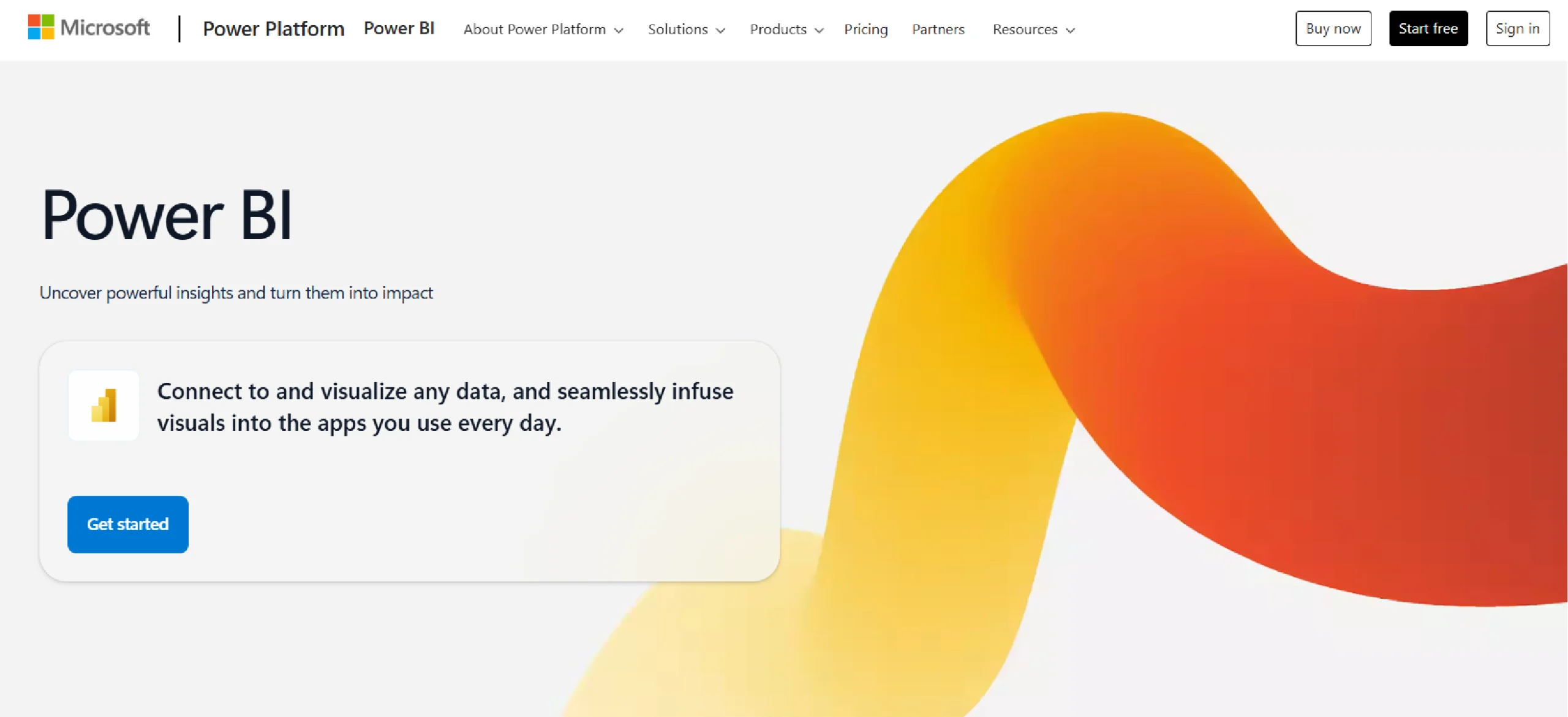
Power BI is a business analytics platform developed by Microsoft that helps users visualize and share insights. It turns unrelated data from various sources into interactive reports and dashboards.
Power BI is composed of several components, including a desktop application and cloud-based services for publishing and collaboration.
Key Features of Power BI
Some of the features of Power BI are:
- Data Connectivity: Power BI connects to various data sources, including files like Excel and cloud services.
- Power Query: This feature prepares and transforms data, allowing users to clean and shape it before analysis.
- DAX Language (Data Analysis Expressions): DAX is a formula language for advanced calculations and creating data models.
- Interactive Dashboards: The software provides tools to create visualizations, reports, and dashboards for data exploration.
Pricing Details of Power BI
Power BI has several pricing options. In April 2025, Microsoft increased prices for the first time in nearly 10 years:
- Power BI Desktop: Free application for creating reports and visualizations
- Power BI Pro: $14 per user/month (increased 40% from $10) for sharing and collaborating on reports
- Power BI Premium Per User (PPU): $24 per user/month (increased 20% from $20) with advanced capabilities including AI features
- Power BI Premium Per Capacity: For large organizations needing to share content broadly without individual licenses for every viewer
Note: Monthly billing adds a 5% surcharge on annual subscriptions.
Disadvantages of Power BI
- DAX learning curve: For advanced calculations and data modeling, users must learn DAX (Data Analysis Expressions), which has a steep learning curve despite the interface being intuitive for basic tasks.
- Limited sharing without paid licenses: To share dashboards securely, all users must have a paid license, making widespread collaboration difficult or costly for larger teams.
- Limited customization for visuals: The core visuals offer fewer customization options compared to some competitors, and advanced changes require writing code.
3. ZOHO ANALYTICS
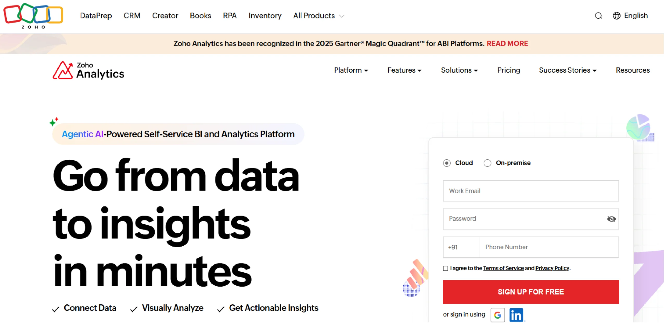
Zoho Analytics is a business intelligence platform that is part of the larger Zoho suite of apps. It is designed to be an affordable and user-friendly option, making it a popular choice for small to medium-sized businesses.
The tool helps you create reports and dashboards from your data, and it includes a built-in AI assistant to help you find insights.
Key Features of Zoho Analytics
Some of the important features of Zoho Analytics include:
- AI-Powered Assistance (Zia): An artificial intelligence assistant that answers questions in natural language and automatically generates reports and insights.
- Extensive Data Integration: The ability to connect with over 500 data sources, including spreadsheets, cloud databases, and various business applications.
- Comprehensive Visual Analysis: A drag-and-drop interface for creating interactive reports and dashboards using over 50 visualization types, such as charts, pivot tables, and map layers.
- Seamless Collaboration and Sharing: Features that allow users to securely share, publish, and embed reports and dashboards with fine-grained access controls.
Pricing Details of Zoho Analytics
- The pricing for Zoho Analytics starts at $24/month, when billed annually (supports 2 users, 0.5 million rows & unlimited Workspaces in the account).
- There are various plans ranging till $455/month when billed annually (50 users, 50 million rows & unlimited Workspaces).
- Zoho Analytics also offers an Always Free Plan ($0) targeted at small end reporting requirements. It supports 2 users, 5 Workspaces and 10,000 rows in your account.
Disadvantages of Zoho Analytics
According to user reviews and documentation, these are some of the cons of Zoho Analytics:
- Confusing UI: The user interface can be confusing due to the number of features and options available.
- Query Limitations: There are limitations regarding the complexity of SQL queries and joining data, though a dedicated Query Table feature exists for advanced users.
- Learning Curve: For new users, there is a learning curve to use all features, particularly advanced ones.
- Performance with Large Data: Zoho Analytics can experience slow performance with large data volumes, though the company offers features to mitigate this.
4. DUNDAS BI
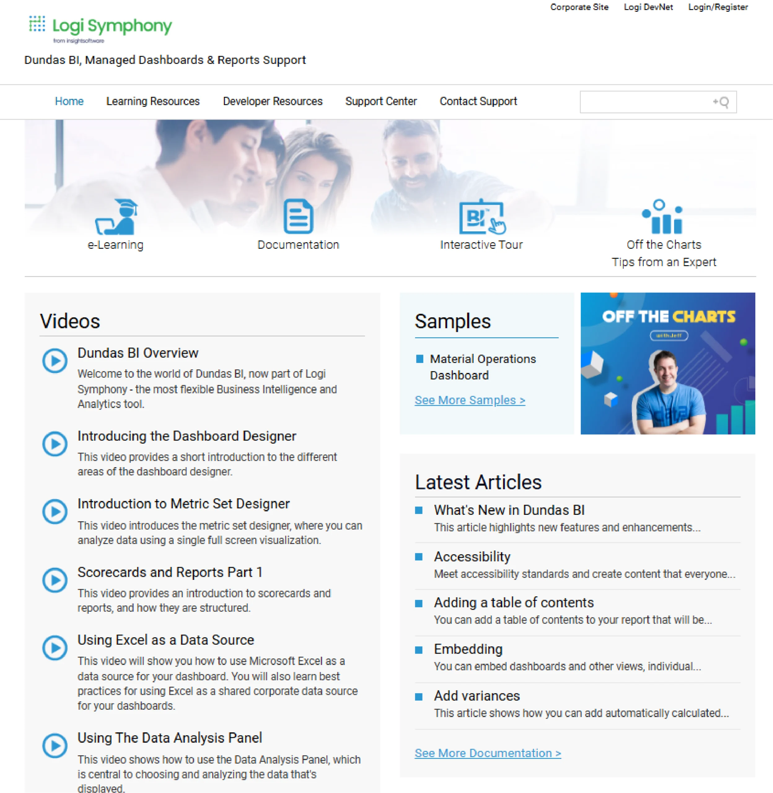
Dundas BI is an enterprise-level business intelligence and analytics platform known for its flexibility and deep customization options.
Now part of insightsoftware’s Logi Symphony, it enables users to create and embed interactive dashboards, reports, and scorecards. The platform supports various data sources and deployment methods, catering to both business users seeking self-service analytics and developers who require extensive APIs for custom solutions.
Key Features of Dundas BI
Some of the key features of Dundas BI include:
- Highly Customizable Dashboards– Fully customize dashboards, data visualizations, interactions, scorecards, and labels to meet unique design requirements.
- Built-in ETL– Stands out for built-in ETL with shared licenses and unlimited refreshes.
- API-Enabled Embedding– Open API architecture with JavaScript or REST interface makes it easy to customize and embed.
- Multi-Platform Deployment– Flexible deployment options including cloud, on-premises, hybrid models across Windows, Linux, AWS, and Azure.
Pricing Details of Dundas BI
Dundas BI follows a custom pricing based on deployment needs. They have no publicly listed pricing (contact sales required).
Disadvantages of Dundas BI
Some of the disadvantages that users face while using Dundas BI are:
- Steep Learning Curve- The learning curve is steep for developers and power users who wish to leverage the platform’s full power, which includes advanced data modeling and deep customization via JavaScript/Python scripting. Basic dashboard creation is generally considered easy.
- Complex Interface- The interface for advanced design and styling (such as color palettes, themes, and branding) is very detailed and can feel overwhelming. This complexity is the trade-off for the tool’s core strength: 100% granular control over every visual element, which simpler tools don’t offer.
5. LOOKER
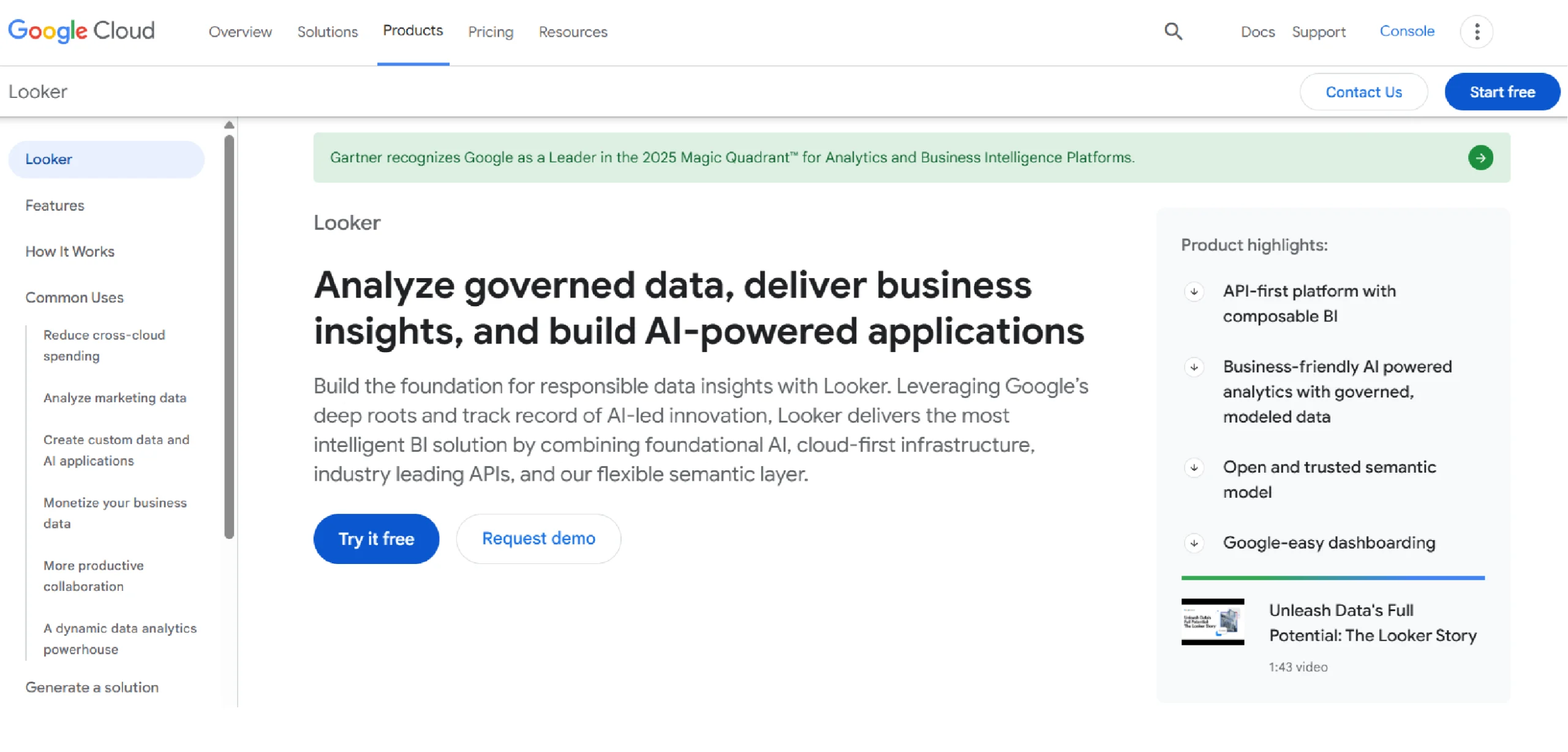
Looker is a modern business intelligence platform founded in 2012 with a semantic layer (LookML) that makes it more robust and scalable for self-service analytics. After Google’s acquisition, it’s now integrated into the Google Cloud ecosystem.
Key Features of Looker
Based on the official Google Cloud page for Looker, here are some of its key features:
- LookML Semantic Layer: A unified code-based layer that defines business rules and metrics centrally.
- Integrated BI and Workflows: Embeds analytics directly into other applications, portals, and workflows.
- Self-Service and Governed Analytics: Allows business users to explore data safely within a governed framework.
- Google Cloud Integration: Built to run natively on Google Cloud, with deep integration into BigQuery and other services.
Pricing Details of Looker
Looker uses a platform-based pricing model rather than per-user fees. You pay for the platform, and then pricing is based on how you use it and the specific edition you choose.
There are two main ways to pay:
- Standard Edition
- A flat monthly or annual fee for the platform
- Includes a set number of users
- Additional users can be added for a cost
- Enterprise Edition
- Custom pricing for larger organizations
- Includes more advanced features and support
- Designed for complex enterprise deployments
Looker also offers embedded analytics pricing for companies that want to include Looker in their own products.
All pricing is customized based on your specific needs, so you need to contact Google Cloud sales for an exact quote.
Disadvantages of Looker
Here are some of the disadvantages of Looker, based on common user feedback and industry analysis.
- High Cost and Complex Pricing: The platform has a high minimum cost, often starting around $60,000 per year, making it prohibitive for small to mid-sized businesses.
- Steep Learning Curve: Users must learn LookML, its proprietary modeling language, to build and maintain data models, which requires significant technical skill and training time.
- Limited Drag-and-Drop Interface: Its focus on a code-centric model means it is less intuitive for non-technical business users who prefer simple, drag-and-drop self-service analytics.
- Viewer License Cost: Even users who only need to view dashboards require a paid license, which can become very expensive at scale.
6. DOMO
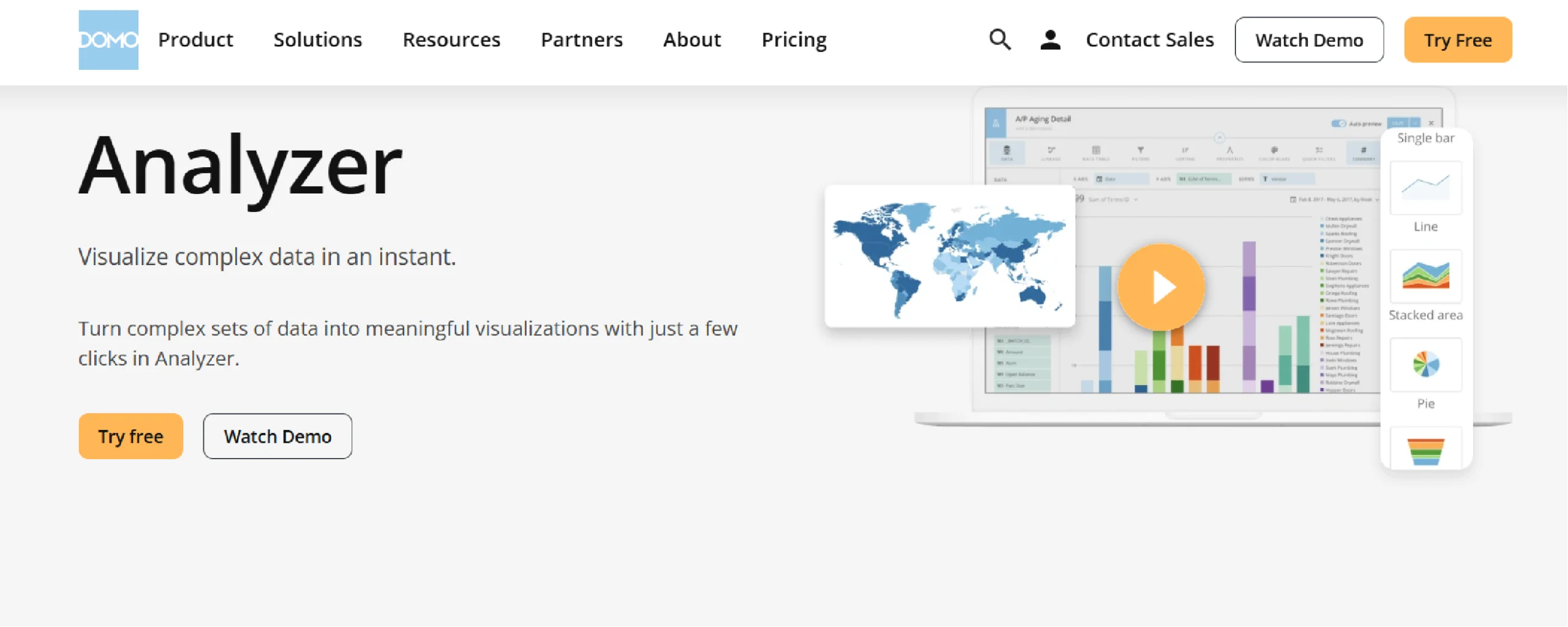
Domo is a cloud-based business intelligence platform that centralizes data from multiple sources into a single system.
It provides tools for creating interactive dashboards and reports, with features like its Analyzer tool for self-service data exploration.
Key Features of Domo
- Centralized Data Foundation: Connects to and unifies data from hundreds of cloud and on-premise sources.
- Drag-and-Drop Analyzer: A self-service tool for business users to explore data and build visualizations without code.
- Custom App Building: Allows creation of tailored applications and dashboards for specific business use cases.
- Embedded Analytics (Domo Everywhere): Enables embedding of live analytics, apps, and data into other workflow tools and portals.
Pricing Details of Domo
Domo uses a custom pricing model based on two main components:
- User Licenses: You pay for each user, with different license types (e.g., Business, Viewer).
- Platform Credits: You purchase a pool of credits for data storage, refresh cycles, and compute capacity.
There is no standard per-user monthly fee listed publicly. All pricing is customized and requires contacting their sales team for a quote. The cost depends entirely on your specific needs for users and data volume.
Disadvantages of Domo
The following are some of the disadvantages Domo’s customers face based on common user feedback.
- Complex and Expensive Pricing: The credit-based model combined with user licenses leads to high, often unpredictable costs.
- Steep Learning Curve: The platform’s extensive features can be overwhelming and difficult for new users to master.
- Performance with Large Datasets: Dashboards and reports can become slow when handling very large or complex data volumes.
- High Implementation Effort: Significant setup and configuration are required to get the most value from the platform.
7. SISENSE

Sisense is an AI-powered analytics platform with strong data visualization capabilities.
It allows users to build and share interactive dashboards and charts, focusing on making complex data easy to understand for everyone.
Key Features of Sisense
Some of the key features of Sisense are as follows:
- Interactive Dashboards: Create and share dashboards with drag-and-drop widgets for exploration.
- AI-Powered Insights: Automatically surfaces explanations for data changes and trends.
- White-Labeling & Embedding: Fully customize and embed analytics into other applications.
- Code-Free Visualization Builder: Allows users to build charts and graphs without writing code.
Pricing Details of Sisense
Sisense does not publicly list its pricing. It operates on a custom quote-based model.
Costs depend on factors like:
- Deployment type (cloud or on-premise)
- Number of users
- Data volume and processing needs
You must contact their sales team directly for specific pricing.
Disadvantages of Sisense
- Complex Pricing Model: The custom, quote-based pricing is not transparent and can include hidden costs.
- Steep Learning Curve: The platform can be difficult to learn and master, especially for non-technical users.
- Performance Issues: Dashboards can become slow when handling very large or complex datasets.
- High Cost: It is generally considered an expensive solution, particularly for small to mid-sized businesses.
8. KLIPFOLIO
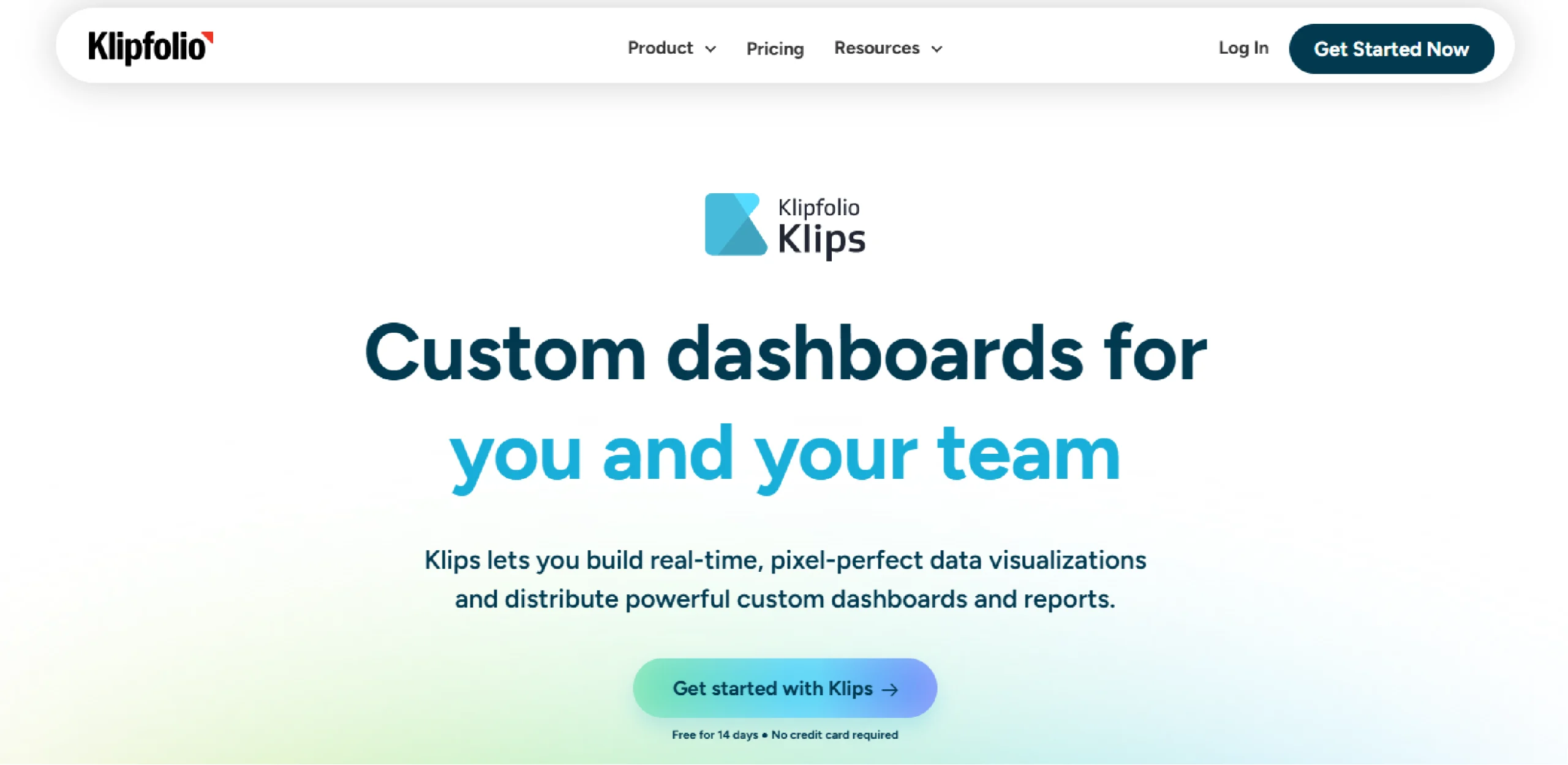
Klipfolio is a cloud-based business intelligence platform that specializes in real-time data dashboards.
The platform uses “Klips” – individual visualization widgets – to build custom dashboards that connect to hundreds of data sources for live metric tracking.
Key Features of Klipfolio
- Pre-built Visualization “Klips”: A library of individual, customizable metric widgets for dashboards.
- Real-time Data Connections: Connects to hundreds of live data sources for up-to-date metrics.
- Drag-and-Drop Dashboard Builder: An intuitive interface for assembling and customizing dashboards without coding.
- Custom Formula Builder: Allows users to create calculated metrics using a spreadsheet-like formula language.
Pricing Details of Klipfolio
Klipfolio offers four main plans for businesses, with discounts for annual billing. All plans include unlimited users (viewers) and access to 130+ data integrations.
- Base Plan
-
-
- Price: $120 per month (billed monthly)
- Data Refresh Rate: Every 4 hours
- User Limit: 3 users (editors)
-
- Growth Plan
-
-
- Price: $190 per month (billed monthly)
- Data Refresh Rate: Every 1 hour
- User Limit: 10 users (editors)
-
- Team Plan
-
-
- Price: $310 per month (billed monthly)
- Data Refresh Rate: Every 15 minutes
- User Limit: 20 users (editors)
-
- Team+ Plan
-
- Price: $600 per month (billed monthly)
- Data Refresh Rate: Up-to-the-minute
- User Limit: 40 users (editors)
All plans offer significant savings when billed annually.
Disadvantages of Klipfolio
- Steep Learning Curve: Requires learning proprietary formulas and functions, which can be difficult for non-technical users.
- Performance with Large Datasets: Can become slow or unresponsive when handling very large volumes of data.
- Complex Data Modeling: Blending data from different sources can be challenging and less intuitive than in other tools.
- Limited Advanced Visuals: Offers fewer options for complex chart types and advanced customizations compared to leading competitors.
9. Qlik Sense
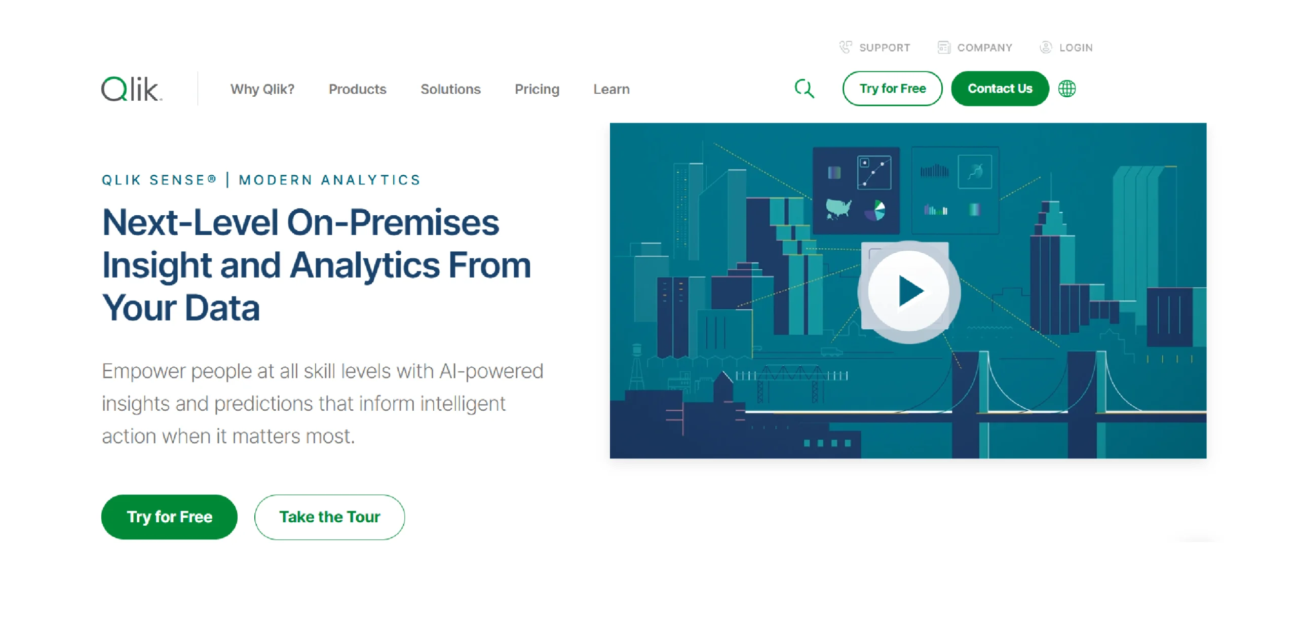
Qlik Sense is a data analytics platform that uses a unique associative engine for data exploration.
It enables users to create interactive visualizations and dashboards, allowing for free-form discovery across all their data relationships.
Key Features of Qlik Sense
- Associative Engine: Allows users to explore data freely, seeing all relationships and filtered selections instantly.
- AI-Powered Insights: Automatically generates analysis and suggests relevant visualizations and associations.
- Interactive Dashboards: Enables creation of self-service visual analytics and guided reporting apps.
- Centralized Management Hub: Provides a governed, single source for all metrics, data models, and security rules.
Pricing Details of Qlik Sense
Qlik Sense offers two main cloud plans:
- Qlik Sense Business: $30 per user per month
- Enterprise: Custom pricing
Both plans include the associative engine and core visualization capabilities. The Enterprise plan adds advanced governance, automation, and multi-cloud deployment.
Disadvantages of Qlik Sense
Here are some disadvantages of Qlik Sense, based on common user feedback.
- Steep Learning Curve: The associative model and scripting interface require significant training to master.
- High Cost: Becomes expensive at scale, especially for larger user deployments.
- Complex Setup: Initial configuration and data modeling can be time-consuming and require technical expertise.
- Resource Intensive: Can demand substantial system resources and memory for processing large datasets.
10. IBM COGNOS ANALYTICS
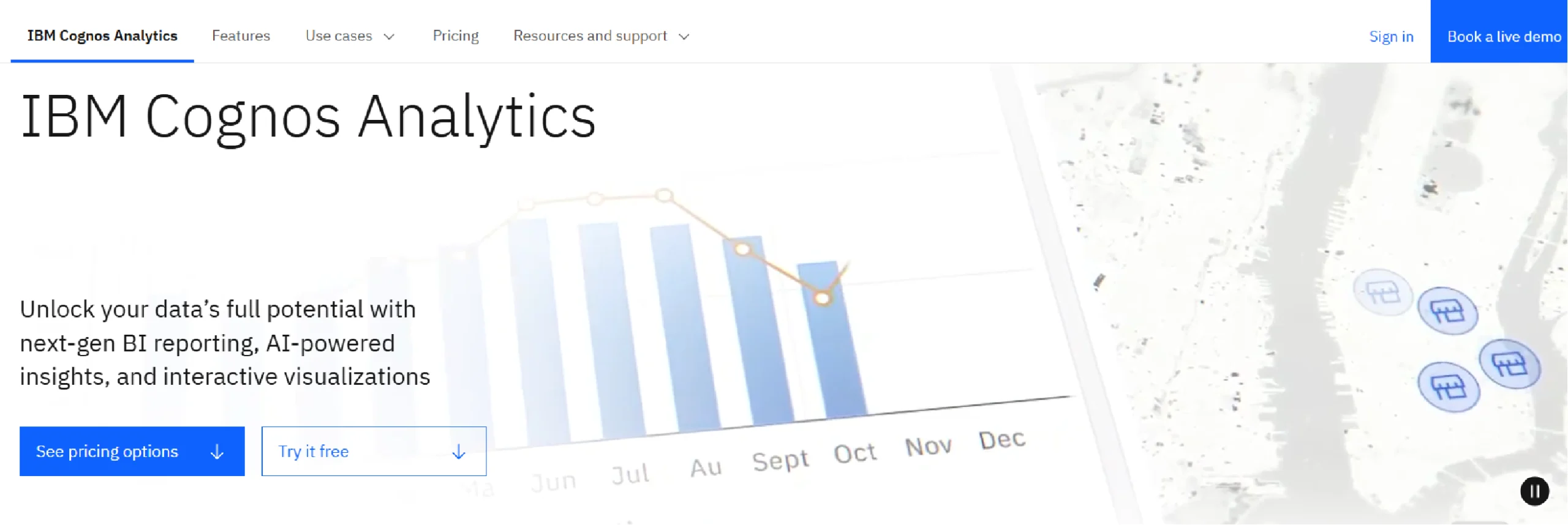
IBM Cognos Analytics is an AI-powered business intelligence platform for enterprise-scale data.
It provides integrated tools for data visualization, reporting, and dashboarding, all within a governed and secure environment.
Key Features of IBM Cognos Analytics
- AI-Assisted Dashboarding: Uses AI to automatically generate dashboards and suggest visualizations from your data.
- Interactive Dashboards: Enables creation of self-service, interactive dashboards with drag-and-drop functionality.
- Automated Data Preparation: Includes AI-powered data cleaning, joining, and modeling to prepare data for visualization.
- Integrated Reporting: Combines interactive visualizations with traditional pixel-perfect reporting in a single platfo
Pricing Details of IBM Cognos Analytics
IBM Cognos Analytics uses a tiered, per-user subscription model for its cloud offering:
- Standard User: $10.60 per user per month
- Premium User: $42.40 per user per month
The Premium plan includes advanced features like managed sandboxes and production data pipelines.
Disadvantages of IBM Cognos Analytics
Here are some of the disadvantages of IBM Cognos Analytics based on common user feedback.
- Steep Learning Curve: The interface is complex and requires significant training for new users.
- Less Intuitive for Self-Service: It is less user-friendly for business users wanting quick, ad-hoc visualizations compared to modern tools.
- Slower Performance: Can be slower to load and interact with when handling very large datasets.
- High Total Cost: Becomes expensive due to user licensing and the need for specialized administrative support.
Fueling Your Data Visualization Tools with Web Data
Your data visualization tool is only as useful as the data you put in it. While internal data is essential, external web data often completes the picture.
Many teams need external information like:
- Competitor pricing
- Market trends
- Customer reviews
- Product catalogs
Collecting this data manually from websites is time-consuming and difficult to maintain at scale.
Web scraping services provide a practical solution. They automatically gather public web data and deliver it in clean, structured formats. This data can feed directly into your visualization tools.
Example: Building a Pricing Dashboard
Here’s how it typically works:
- A service like ScrapeHero collects daily pricing data from target websites
- Data is delivered via API or CSV files
- Your visualization tool (Power BI, Tableau, etc.) imports this data
- Your dashboard updates automatically with current market prices
This approach works for various use cases including market research, lead generation, and brand monitoring.
If you need reliable web data for your visualization projects, ScrapeHero offers custom web scraping services to meet your specific requirements.
Why ScrapeHero Would Be Your Right Data Partner
Collecting web data requires specific technical skills. You need to manage proxies, handle anti-bot systems, and maintain data pipelines. This can distract your team from their core work.
ScrapeHero web scraping service handles these technical challenges for you. We focus on reliable data delivery so you can focus on analysis.
Here’s what we provide:
- Reliable Data Collection
We manage the infrastructure needed for large-scale web scraping. This includes proxy rotation, CAPTCHA solving, and handling website changes. - Structured Data Delivery
We deliver data in ready-to-use formats like CSV, JSON, or through APIs. The data arrives clean and organized for your visualization tools. - Ongoing Maintenance
Websites change frequently. We monitor and update our scraping processes to ensure your data flow continues without interruption. - Custom Solutions
Every project has different needs. We build custom scrapers for specific websites and data requirements.
This approach lets your team work with fresh web data without maintaining the technical infrastructure.Use this guide to select your ideal platform from the top data visualization tools for 2025. And if you need a reliable pipeline of web data to power your new dashboards, talk to the ScrapeHero team to get started.
FAQ
For personal use, Power BI Desktop is the most powerful free option. For quick, public-facing charts and simple dashboards, Google Looker Studio is an excellent and completely free choice.
Looker (Google Looker) is an enterprise platform with a semantic layer (LookML) that requires custom pricing. Looker Studio is a separate, free tool for building reports and dashboards. They are different products.
Start with Zoho Analytics or Power BI. They offer the best balance of affordability and features for small to medium-sized businesses. Both have robust free or low-cost entry points.
Most tools connect to data via CSV files, Google Sheets, or an API. A web scraping service (like ScrapeHero) can automatically collect public web data and deliver it in these formats, ready for your tool to import.
Sisense, Dundas BI, and Looker are all strong choices for embedded analytics, offering high levels of customization and white-labeling.
It depends on the tool and your experience. Tools like Power BI and Tableau have a steeper learning curve for advanced features. Looker Studio and Zoho Analytics are generally considered easier for beginners to pick up.
It typically means you pay a license fee for each person who accesses the platform. However, the specifics vary by tool:
1. Some tools (like Power BI, Tableau, Looker) charge for both creators and viewers
2. Other tools (like Klipfolio, Domo) offer unlimited viewer licenses and only charge for editors/creators
Always verify the licensing model for your specific tool to calculate total costs accurately.
In most cases, yes. Power BI integrates seamlessly with other Microsoft products like Excel, SharePoint, and Teams. This makes it the most logical and cost-effective choice for teams already in the Microsoft ecosystem.
The 5 C’s are guiding principles for creating effective charts:
Clear: The message should be easy to understand.
Concise: It should be to the point, without extra clutter.
Captivating: The visual should engage the viewer.
Consistent: Use the same colors and styles for the same types of data.
Credible: The visualization should honestly represent the data.
Current major trends include:
AI-Powered Analytics: Tools now use AI to automatically find insights and generate charts.
Interactive Dashboards: Moving from static reports to dashboards where users can filter and drill down into the data.
Data Storytelling: Focusing on creating a narrative with data to make it more memorable.
Embedded Analytics: Integrating charts and dashboards directly into other business apps.
The most popular tools among professionals are Tableau, Microsoft Power BI, and Qlik Sense. For developers, Python libraries like Plotly and Matplotlib are extremely popular.
Yes, but with limitations. ChatGPT with Advanced Data Analysis (formerly Code Interpreter) can create charts and graphs directly by writing and executing Python code internally – you’ll see the visualization right in the chat.
Basic ChatGPT can write visualization code (in Python, R, or JavaScript) that you would need to run in another program to see the actual chart.
For professional business intelligence work, dedicated tools like Tableau or Power BI offer more sophisticated features, better performance, and easier collaboration than AI chat interfaces.